 Are you looking for a few tried and true Pinterest pin styles you can use to start creating your own Pinterest pins? With Pinterest rewarding pinners who pin new content often, It’s a good idea to have some go-to layouts to reference for your own pins.
I’ll be the first to admit that I have a Pinterest addiction. I’ve been using the platform since its launch in January 2010 and I’ve seen my fair share of pins over the years.
Best Pinterest Image Styles
I’ve sifted through and narrowed down thousands and thousands of pins to five simple pin design styles that are perfect for just about any content you want to promote.
[disclosure]
Start creating pins with these five simple layouts and as you get more comfortable and confident, you can expand into more unique and creative pin styles.
How to Create Pinterest Images
All of the Pinterest image styles I’m about to show you are easy enough to create in Canva. (If you’re brand new to creating pins, read my simple guide to creating pins in Canva.)
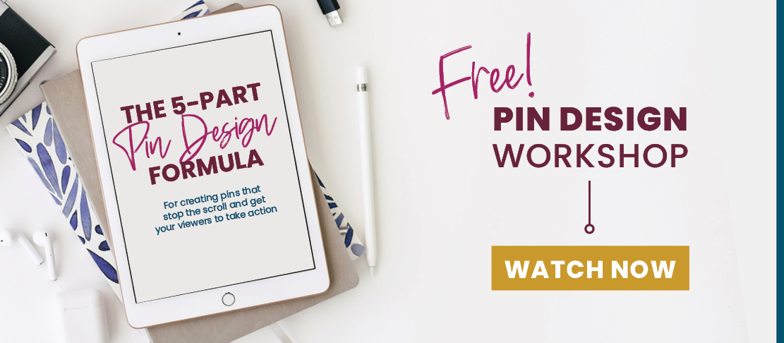
Before we dig into these five pin styles, you’re going to wanna sign up for my free on-demand Pin Design Workshop If you want people to be growing your website and saving your pins, your pins need to look really good.
If you’re ready to go from pin design shame to pin design gain, this training is going to put you on the fast track to creating beautiful pins for all of your content, that actually convert. Click right here to register and the on-demand workshop will be sent to you immediately! (No waiting for a specific time that you can’t commit to.)
First things first…
What Makes a Good Pinterest Image?
- Size: Pinterest recommends a 2:3 ratio for any pin that is uploaded to their site. I like to stick to 600 x 900 px.
- High-quality Images: Pinterest is a visual platform! That means that you have got to use high quality, compelling images to draw your viewers in.
- Text Overlays: In addition to a great image, you should also include a text overlay to let your viewers know what your pin is about. Text should be clear and readable.
- Engaging headline: The headline you choose to use can make or break clicks on your pin. If your headline isn’t engaging and doesn’t tell the viewer what is in it for them, it likely won’t get clicked even if the image is perfect and the text is readable.
- Avoid faces: Pins without faces tend to perform better than pins with faces. Let your viewer see themselves in the pin, instead of someone else engaging in the activities they’re searching for.
- Brand your pins: Branding your pins helps you become instantly recognizable and more memorable than if you didn’t brand your pins. If you have a solid background of great content, your viewers will be more likely to click your pin. Iif you’re trying to grow your reputation, you want to make sure to show up consistently every time someone sees you.
Alright! Let’s jump right into these five magical layouts I’ve been talking about!
Pinterest Pin Design #1
The first design is a pin with a full image background with a semi-transparent color overlay on top, finished off with white or black text on top of that.
Here are a few examples:
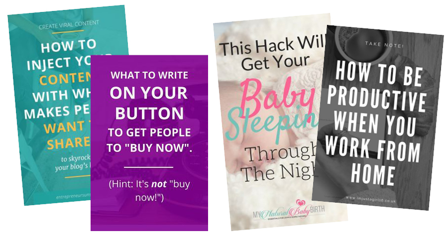
A few design tips to keep in mind when using this design:
Use a brand color for your overlay OR if you don’t have one, pull a color from the image using the Colorzilla browser extension.
Make sure your text is readable. If your color overlay is darker, use white text. If it is lighter, stick with black. Adjust the opacity of your overlay if needed.
Make sure all of your text is aligned correctly. (left, right or centered on your pin). With a pin this simple, any misalignment will stick out like a sore thumb.
Mix and match (brand) fonts until you’ve created a readable, click-worthy headline using what you learned in the previous lesson.
Don’t forget your URL! You can add this to the bottom or the top of your pin design.
Pinterest Pin Design #2
This pin might be the most BASIC pin style out there, but its simplicity makes it super successful! This pin is created by placing text on a solid background color of your choice, likely one of your brand colors.
Here are a few examples:
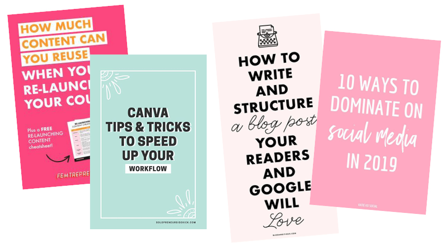
A few design tips to keep in mind when using this design:
Make this style of pin more interesting by getting creative with your font usage. Try mixing and matching fonts to draw attention to certain words in your pin. (But don’t go too crazy!)
This pin works exceptionally well for showcasing your opt-in freebie! Since it will be the only graphic on the pin, they tend to stand out. I’ll show you how to add a mockup to your pins in a later lesson so keep this style in mind for that.
Make this layout a little more eye-catching by adding a subtle pattern over the background, or adding icons or other elements. The solid background is easy to have fun with and put your creativity to the test.
Pinterest Pin Design #3
Another universal pin design is filling up some of your canvas with an image or two, and the rest with your message. You can put a background color behind your text if you’d like, or you can choose to leave it white.
Most often, bloggers will create pins that are half image and half text or break the pin into thirds with the top and bottom being an image and the center containing the text.
This works well for a shorter headline, a pin with no subheading/description or a pin that you choose not to include a CTA on.
Here are a few examples:
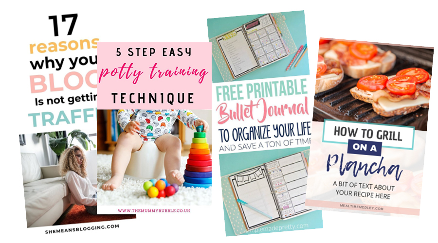
A few design tips to keep in mind when using this design:
If you’re using a color for the background behind your text, use a brand color, or pull a color from the image using the Colorzilla browser extension I mentioned above.
To keep your pin balanced, if your image is lighter, stick with a lighter color and darker text for the background. If your image is darker, a darker image with lighter text will look better.
To break up the half and half layout, consider adding a shape like a circle or square halfway over your image. This will make your pin more interesting to look at. You could add your blog category or even your URL in a rectangle, or if your post is a list of things (18 Ways to Keep a Puppy Entertained) you could put the number in a circle or square. Pinners love to know what they’re in for so highlighting a number is an easy trick to get more clicks.
Pinterest Pin Design #4
A common pin design is when you use a flay lay image that is specifically designed to have text added to it. A flay lay graphic is a styled photo that is shot from above. Many of them are styled in a way that is very inviting for adding your own text! All you have to do is find the perfect flay lay image (Find out where to get 500+ styled stock photos here) drop it onto your document, size it to fit your needs and add your text on top.
The best flat lays can be rotated, flipped and used in any orientation to make your text work perfectly!
Here are a few examples:
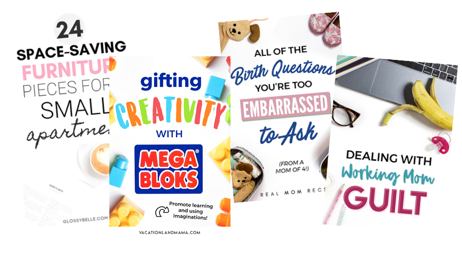
A few design tips to keep in mind when using this design:
Choose flay lays that fit within your branding. You might find it helpful to purchase a set of images you can use that fit your brand.
Keep your text off of the elements in the photo if possible. If you have text that runs on top of the photo, you’ll want to add a block of color behind the text to ensure it’s still readable.
Get creative with your flay lay photos! There are so many ways you can use a single photo. You can zoom in to focus on a specific detail, flip the image vertically or horizontally or add a color overlay to make just about any flay lay unique to your brand.
Pinterest Pin Design #5
This last pin design utilizes color blocks so the options are pretty endless here since you can add color blocks behind words or lines of text, color blocks over a portion of the image and different shapes of color blocks in general.
Here are a few examples:
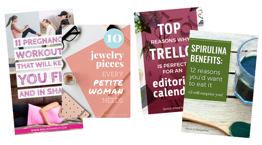
A few design tips to keep in mind when using this design:
Choose a brand color or if you don’t have one, choose a contrasting color or a color from the image.
If you’re putting blocks of color behind the text, make sure there is still enough contrast for your words to be seen!
Use color blocks behind some text to intentionally make certain parts of your headline pop.
Make interesting layouts by playing around with the block of color, trying different shapes and sliding them off of the edge of your document.
Use this technique when your background image is too busy to place text directly on.
Combining Techniques
Some of the best and unique pins are created by simply combining one or more of these techniques. Once you get each design down, try mixing and matching some of the styles and design tips I’ve provided to make your own unique pins. As you’re designing, be sure to avoid these common pin design mistakes.
I can’t wait to see what you create, and don’t forget to sign up for my free ON DEMAND Pin Design Workshop, The 5-Part Pin Design Formula!
 FREE AI BRANDING TRAINING On APril 29 - SAVE YOUR SEAT!
This is super helpful! Thank you so much!
Glad you found it helpful!