Do you want to make your audience wonder how in the heck you are showing up literally everywhere?
In this post, I’m going to show you how to make it happen by creating consistently branded graphics to market your content and help your business get seen, heard, and remembered no matter where you are marketing yourself online.
Yep – all of that is possible when you put a focus on how you are visually showing up online! Looks matter, am I right?!
In this tutorial, I’m using:
- Canva (the free version will work, but Pro makes it a little bit easier – here’s a link to check it out for FREE for 30 days!)
- A set of social media templates from my template shop
- Your brand image elements (fonts, colors, imagery, etc.)
Start With a Set of Pre-Designed Templates
This tutorial will help you quickly modify any set of templates of your choice. There are lots of templates available right inside of Canva, but some of them can be overused and a bit generic. It’s also hard to find templates that have a consistent style. Because of this, I recommend you pop off of Canva and check out other sources for templates!
Check out my template shop here!
Have Your Brand Elements Handy
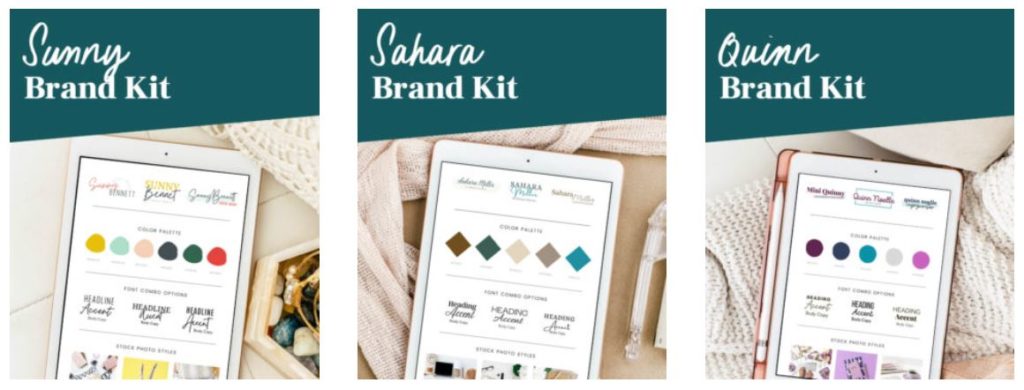
For this tutorial, I am going to be using the Natalie Brand Kit from my Mix and Match Brand Kits, however, you will want to use your own font combinations, color palette, and brand imagery that supports the overall vibe and tone of your brand.
You can add additional design elements if you have them, but for this example, I’ll be keeping it simple with fonts, colors, and stock photos.
If you haven’t yet decided on your brand image and keep changing your fonts, colors, and overall style, check out my Mix and Match Brand Kits here!
Edit the Colors Used in the Templates
With your templates open, the first thing that you want to do is change the colors. It is important to know that Canva handles shapes and fonts differently when it comes to colors. You’re going to be changing the colors of your shapes first, and then going through and changing the colors of your fonts.
Change The Colors of The Shapes
To do this, select the color that you want to change. Click on the color square to open the color panel and change the color.
(If you have Canva Pro, you can upload your brand colors in advance, and they are always going to appear in this color panel. If you don’t have Canva Pro, you can paste your color swatches into an empty page inside your template document. This way, your brand colors will be easily accessible in the document colors in the color palette.
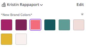
Once you select the color that you would like to change, you’re going to see a purple “Change All” button pop up in the very lower-left corner of the panel. This here is the trick to saving lots of time changing colors! Click the button to change all shapes that were that color to the new color of your choice. Do this for each of the colors that are used in the templates.

Change the colors of the fonts
Because Canva handles shapes and colors differently, you’ll notice that the colors of your fonts have not been affected. You’ll follow the same process outlined above to change the colors of all fonts in your set of templates.
Again, you’ll see the same purple “Change All” box pop up in the lower left-hand corner, you’ll click that button to accelerate this process and change all of the fonts throughout all pages in your document, for all colors used.

Edit the Fonts Used in the Templates
If you have Canva Pro, then you’ve likely already added your fonts into the brand kit. If not, you can do that now. Once you have your brand fonts selected, you’ll have easy access to them in the fonts panel.
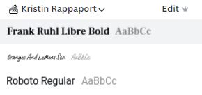
If you don’t have Canva Pro, just take note of the fonts you’re planning on using in your templates. You definitely want to use the same fonts (I recommend 2-3) to keep your graphics looking really consistent.
Change Each Font
It’s important to change the same font throughout all of the templates. You’ll notice that your chosen font sticks to the top of the font panel in the recently used section so you don’t have to keep searching for your font in the long list of fonts to replace it.

If you want to change two text boxes at the same time, you can hold the shift key on your keyboard to select multiple boxes at once. Depending on what fonts you’re using, your templates can start to look a little bit wonky at this point, but that’s okay. You can adjust later.
Do this same process to replace all of the fonts in your template set.
Adjust the Sizing
Once you have all of the fonts changed over, you can adjust the sizing to make the text fit better in the template. This is going to be edited again when you actually create graphics for your real content, but for now, we’re just getting these templates branded.
While you’re adjusting, make sure that all of your text boxes are properly aligned. You can easily align text with Canva’s align tool.
Add Your Own Stock Photos
The next thing you want to do is add in your stock photos! These are going to make your templates really come to life!
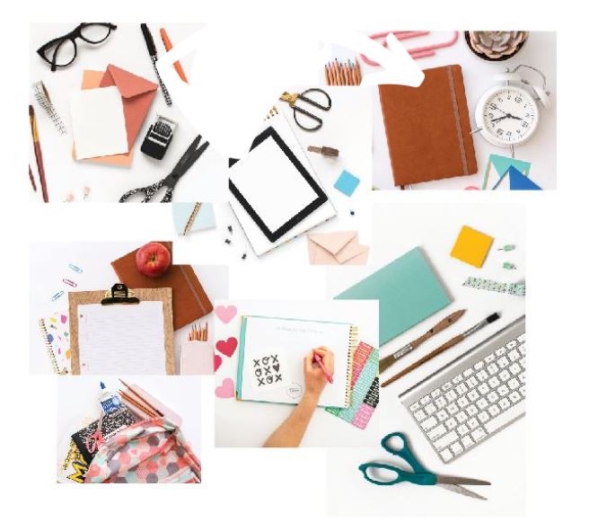
It’s best to keep your stock photos organized in a specific folder inside of Canva. This makes it really easy to access them while creating graphics and will help keep your images on brand.
As you add your images to the templates, you can also get a little creative:
- Adjust the transparency of the images
- Add a color overlay to infuse your brand even more
- Zoom in, crop, flip or rotate images
Here are some more creative things you can do with your stock photos.
Make Sure Your Text is Readable
The most important thing is to make sure that everything is readable on your graphic.
You might need to tweak the text and placement a bit once you get your photos in if the colors don’t work as you planned or the text isn’t readable on the graphic.
When you’re working with stock photos, it’s important to think about how you are going to incorporate the text into your photo. I love photos that incorporate a bit of natural white space because that makes a perfect little area to drop your text.
Here are some creative ideas for these templates:
- Add some text effects to the text
- Adjust the line spacing or the letter spacing
- Change the colors
- Change the transparency
- Add a gradient
- Move the location of the text
The options are really endless, and that’s what I love most about using templates! You can customize them as little or as much as you like.
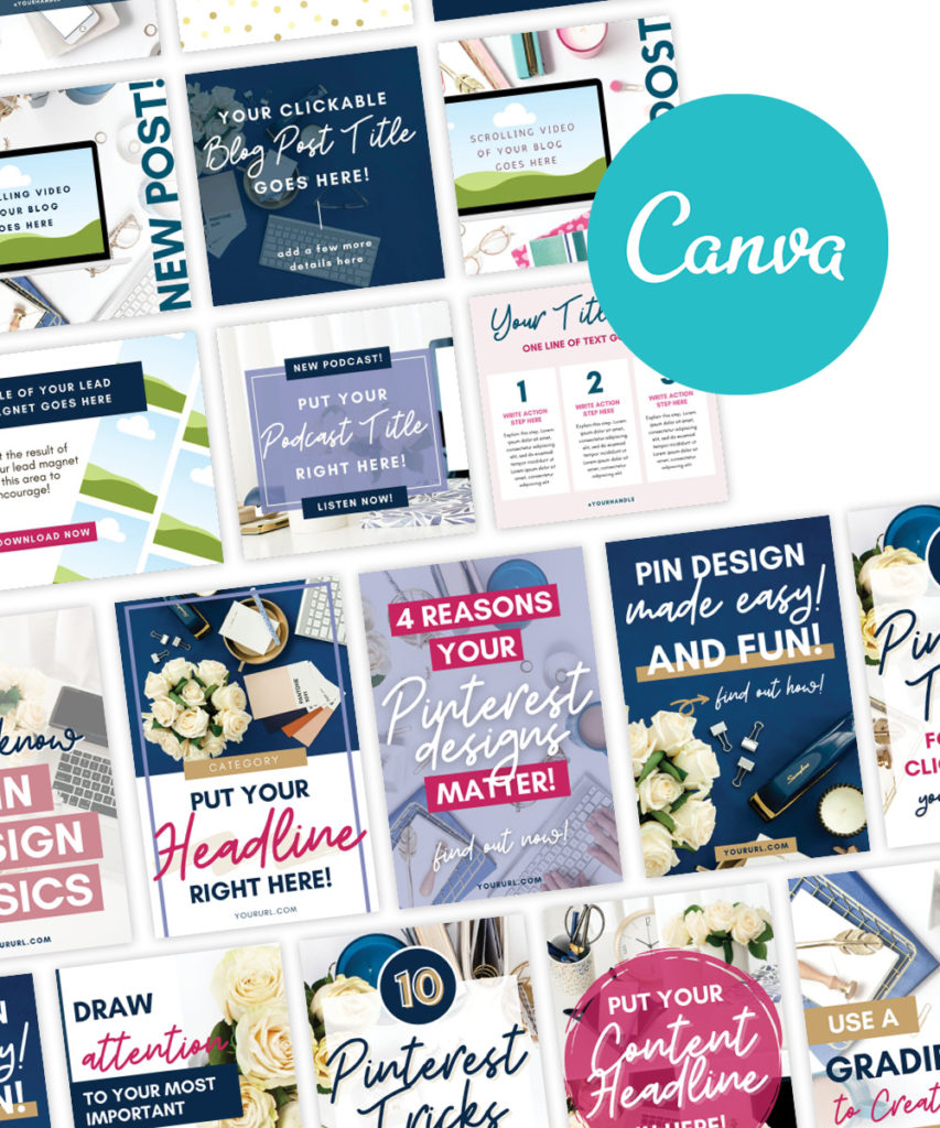
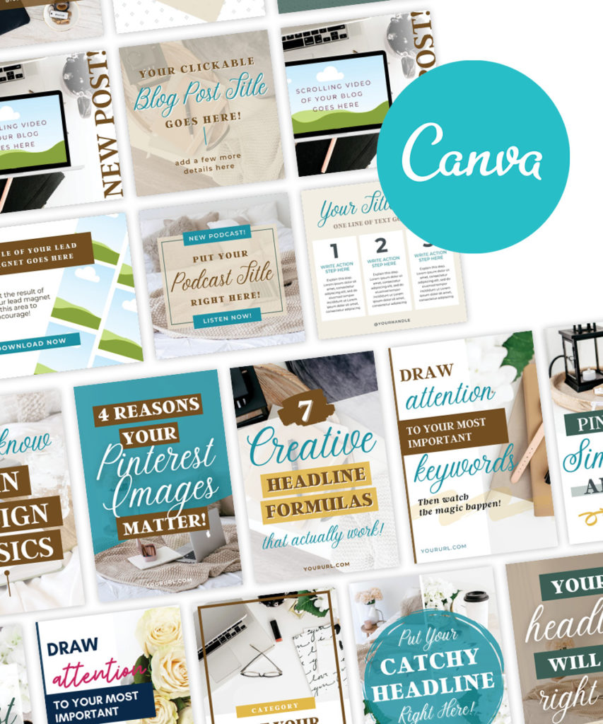
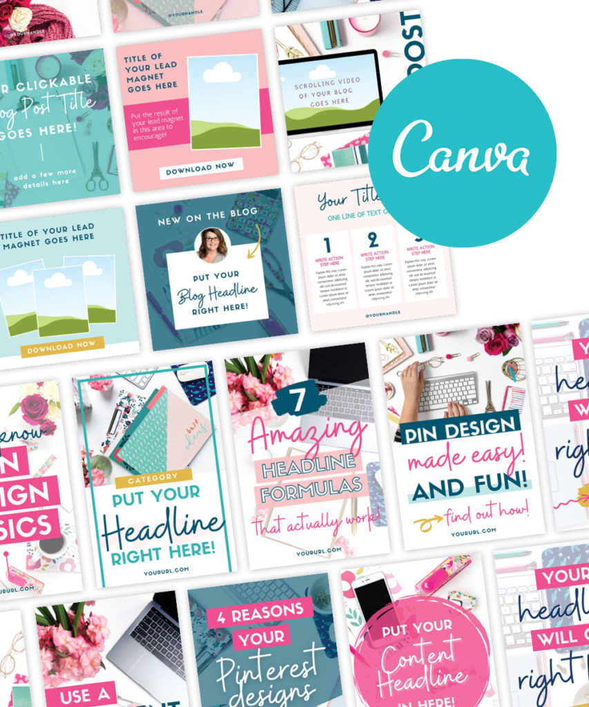
When it’s time to add your own content, these templates will so easy to edit and you’ll be able to quickly create just about any social media graphic you need to market your business!
Visual Consistency is KEY When it Comes to Your Graphics!
Having a consistent brand image is an absolute must if you want to maximize your content and exposure, and let’s not forget to mention all of the time that you’re going to save designing in Canva!
If you want a step-by-step breakdown on how you can create a more consistent personal brand image, then be sure to grab my brand and design quick start guide, where I walk you through the whole entire process.
If you like this article and you want more branding and design tips, there are a few ways we can connect!
👉Grab one of my awesome freebies
👉 Subscribe to my YouTube channel
👉Follow me on Instagram
I can’t wait to see what you create!
XO Kristin
Liked this post? Share the love and pin your favorite image for later!
 FREE AI BRANDING TRAINING On APril 29 - SAVE YOUR SEAT!