 Have you ever designed some blog graphics only to feel super disappointed at how they turned out? So you attempt to try something else. And you keep moving things around. You switch up the colors. You change the font. But you just can’t figure out what’s wrong and how to fix it.
You end up posting blog graphics that you aren’t even proud of – but heck, you don’t want to waste any more time, do you?
You cringe as you post it because you know your blog graphics could be better. Will people even click on that? Will they take you seriously? Lots of questions go through your mind – because you know how important your blog graphics truly are.
Your Blog Graphics are Important
Do you know that you should be spending the same amount of time on your blog graphics that you do on your written content? This includes a blog post image, supporting images to break up your textual content, multiple Pinterest pins (Pinterest suggests you pin new pins/content a few times a week!), and other social media images you might need to create to drive traffic to your written content.
When you’re ready to take your blog to the next level, you might want to create an ebook or opt-in type lead magnet. You need graphics to make that work too. You’ll also need mock-up images, promotional graphics, visual call to actions, and maybe even ads to support your new email magnet.
You Have Five Seconds to Win Your Readers Over.
As your audience scrolls through the oversaturated market on various social media platforms, how are you going to catch their eye? You see so many other bloggers who have beautifully designed and professional-looking graphics that support your blog. Do you ever feel like you can’t compare?
Dedicate Time to Creating Blog Graphics
You probably feel like you just don’t have the time to invest in creating blog graphics. But the truth is, is that you need to make time. Seriously. I spend about 50% of my time creating visual content to support my blog articles, services, and paid products. I dedicate HOURS to designing the perfect visuals to support what I have to offer. And you should too. You will be amazed at how much easier it is to draw your visitors in, keep them engaged, and turn them into loyal fans when you have stellar graphics to back up your offerings.
In this post, I am going to go over five tips that you can implement right away on every one of your blog graphics that you design:
1. Use The Best Stock Photos
A good image can help your content be read, a GREAT image can help your content be SPREAD. This article from TAPSNAP states that “Photos are the most engaging type of content on Facebook, with a whopping 87% interaction rate from fans”.
Choose images that evoke emotions. Don’t always go for the first one that catches your eye. Use images that are related but don’t tell your whole story. Images are meant to support your content, not take it over.
Follow the above rules, and you’ll end up with some kick-ass images that will attract your readers before they read a word of your content. Here are some creative ways to use stock photos in your blog images.
2. Make Them Eye-catching!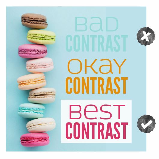
In today’s fast-moving world of content overload, it’s essential that you do everything that you can to make your message jump off of the screen and into your viewer’s radar.
You’re no stranger to what it is like as you scroll through your Facebook or Pinterest feed. You scroll, scroll, scroll until something of interest catches your eye. This my friends is CONTRAST.
As you design your blog graphics, try playing with different colors, using shapes and testing out different fonts/font weights until your message screams “READ ME!”. Contrast not only helps images look interesting, but it also directs your readers to exactly what you want them to see.
Contrast is something I talk about in my post about the “core four” design principals. Understanding what it is and how to use it in your blog graphics is essential if you want to produce visual content that is actually taken seriously.
3. Make Sure They’re the Right Size
There is nothing worse than graphics that are cut off on a particular display. You always want to make sure that you are designing your blog graphics and social media graphics at the correct size. They should be saved at 72dpi, as that is the preferred resolution for screen viewing.
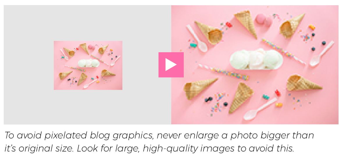
Another thing to watch out for are pixelated graphics. You never want to resize a photo incorrectly: making it too large or scaling it unproportionally are no-nos! If you are designing printable .pdf’s, checklists or anything else that you think your reader will print, you need to make sure it is 300dpi. This is the best resolution for printed documents.
4. Follow Basic Design Rules
Just a little bit of design knowledge can go a long way. So many bloggers that I have talked to so desperately want to learn how to design better graphics for their blog, but just don’t know where to start.
I get it – there are hundreds of design resources online and dozens and dozens of tutorials – but how on earth are you supposed to put that all together into something that makes sense?! Where will you even begin when it comes to learning basic design principals? Well, one of the best ways to learn something new is to focus on what to avoid.
Free Graphic Design Training
If you’re ready to learn some basic design, enroll in my Free 30-Minute Graphic Design Traning to learn some great design tips for creating your opt-in freebie. YES, it’s only 30 minutes (cause I know you’re busy!) but you are going to learn SO much! You’ll also get a very brief introduction to six super important graphic design principles that will improve your graphics when you use them.
I cover things like alignment, hierarchy and font usage (plus seven more!). I cover address each mistake and then show you exactly what to do instead. You’ll be designing better in no time.
5. Make Sure Your Blog Graphics are Aligned With Your Brand
You want people to recognize you, right? One of the tried and true ways to achieve this is to brand your images. Think about the brands that you often interact with. What draws you to them? Is there a specif vibe they put off? Do you notice that brand when you see it?
If you are planning to be seen all over social media, you need to have a specific and cohesive look to all of the visual content you produce. Can you imagine if Mcdonalds had an ad that pulled brand pieces and parts from Goodyear Tire? Doing that would dilute the brand and make it unrecognizable.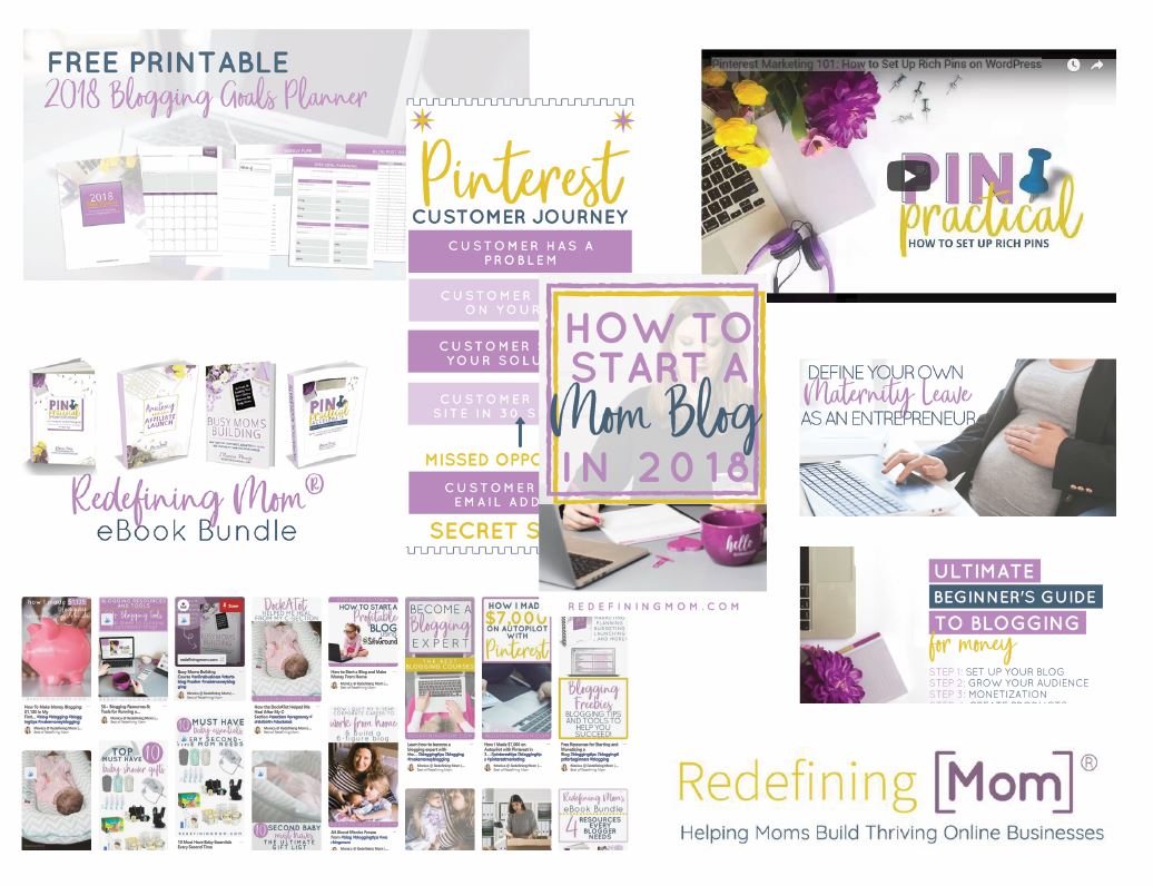 My friend, Monica, from Redefining Mom, is a perfect example of staying on brand throughout all of her blog graphics. Keeping all of her colors, fonts and styles the same makes her recognizable and memorable. Two things all bloggers want to be!
Design your blog images and visual content with intention. Make it work harder for you by creating graphics that look like they came from the same “place”. Your website is technically your online storefront, and you want people to recognize you, notice you and feel a connection with what you have to offer.
6. Use Readable Fonts
Remember what I said about the fast-moving social media feeds? You need a clear message, and a clear message starts with readable fonts. There are so many wrong ways to use fonts.
Since many readers are viewing your content on a mobile device, always make sure that your fonts are readable when your graphic is mini-sized. What looks good on your laptop or desktop might be unclear and hard to read on a smartphone. If your text isn’t readable, you’re setting yourself up to be glossed over and blend in.
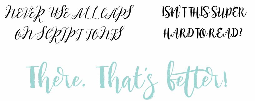
Make sure your text doesn’t blend in with the background. (Try a color, black or white overlay to fix this design problem) Lastly, avoid using script fonts in all caps. These beautiful fonts were never made to be used this way and result in a painfully hard to read message.
7. Optimize Your Images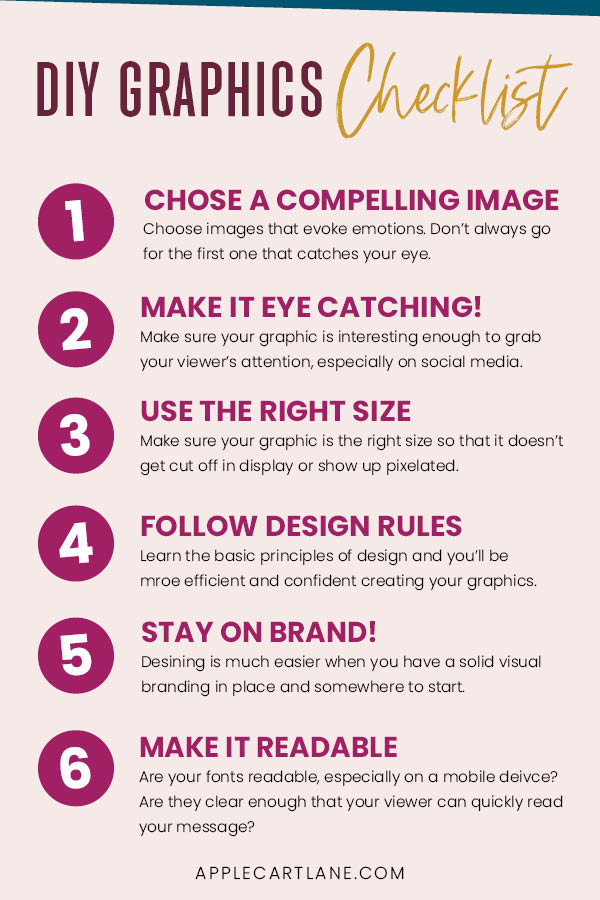
Today’s content has to contain a good amount of supporting visual graphics to be successful. Us humans are visual creatures who get bored quickly. We want pretty things to look at. We want images that break down the content piece by piece. We need a break from reading to simply LOOK at something.
Since we’re using more images than ever before, you need to make sure to optimize them so that they don’t slow your blog or website down. This includes making them the correct file type, size, and maybe even using a compression plug-in like WP Smush.
Fellow blogger, Elna Cain wrote a very detailed article on image optimization that you should read if you want to be sure you’re doing everything you can when it comes to image optimization.
Wrapping Up
I hope these tips provide a solid plan to follow as you create graphics and visual content for your blog or online business Your blog graphics are important! Harness the power of them and truly use them to your advantage.
Stand out from the people who are writing about the same things you are. Use your blog graphics as a way to connect with your viewers. If you dedicate a bit of time to improving the design and aesthetic of your blog graphics and, I promise, it will pay off in the end!
I can’t wait to see what you create!


This was so helpful! Thank you! 🙂
Great tips!! I have zero in creativity so I need all the tips!
Original nebo generikum? U nas mate oboji za nejlepsi cenu
https://opravdovalekarna.cz