I recently asked “What’s holding you back when it comes to creating your own visual brand and designing graphics to market yourself online?” and the answers came back loud and clear:
“I want to create a consistent look for my business, but I don’t know where to start…”
“I have zero eye for design and absolutely no idea what looks good!”
“I can’t decide on fonts and keep changing my color palette”
“I’M NOT CREATIVE ENOUGH TO DO THAT!!!”
Here’s the thing: If you can spin up a business, you absolutely have it in you to create a DIY brand and graphics that work for you, instead of against you.
You don’t need to be a trained graphic designer, use expensive design software and start from scratch every.single.time!
How to Build a Magnetic Brand + Graphics That Attract
Today, I’m breaking down step-by-step the exact process you’ll need to follow to build a magnetic DIY brand that attracts and graphics you’re confident to share.
Why? Because I believe that your brand and graphics (or lack thereof!) should never hold you back from building the business of your dreams.
Let me start off by saying that we’re probably a lot alike.
I haven’t always been a confident designer. In fact, most of the skills that I’ve learned are completely self-taught.
I’ve spent more hours than I’d like to adding fiddling around in design programs and moving things around until they’re just right. Especially when it comes to creating graphics for my business.
Over the years, I’ve learned a few things about the visual side of marketing your business online.
It doesn’t matter if you’ve been hacking together graphics for years, or just getting started in the “design world”, you’re probably feeling a little overwhelmed.
You’re ready to level up your brand so that you actually look like the professional you are, and you NEED to create all kinds of graphics to promote your awesome content, offers, products, or services!
I’ve been designing for over 15 years, and I’m here to help!
After years of designing for ad agencies, in-house marketing departments, clients and now, myself, I’ve broken the whole branding + design thing into something that is easy to follow and actually makes sense. It’s a framework, and it’s super simple to learn and implement.
And since I’m on a mission to help you DIY your brand + graphics so you can look and feel professional online, I’m going to walk you through the entire framework in this mega post:) YAY!
First, I want you to forget everything you think you “need” to build a brand and create awesome graphics.
- You don’t need expensive design software.
- You don’t need to be the most creative person on earth with endless genius ideas.
- You don’t need to spend a ton of money.
- You don’t need to create graphics from scratch, every time.
This is the part where I’m supposed to tell you that I had NO IDEA what I was doing and somehow figured it out…
But here’s the truth: I haven’t been in your shoes before. Branding and design has never gotten in my way or held me back from being successful online.
There. I said it.
Branding + design is easy for me. It just makes sense. I used it to grow my business online, super quick, and I want the same for you!
Let’s dig into the framework!
Before You Get Started With Your DIY Brand, You’ll Need a Few Things:
-
Clarity on your business idea
You need to understand why you’re in business, who you want to serve, how you plan to serve them and what you are going to offer. For example, I’m in business because my brand + graphics totally amplified my business success (and my confidence!), and I want the same thing for you. I serve online business owners, service providers, and digital product creators. I serve through helpful content on this blog and online branding + design courses.
-
A design program
I use, LOVE, and recommend Canva. This says a lot since I used to be a total Adobe InDesign snob! It’s so simple to use and crazy intuitive, even if you’re NOT a designer. There is a free version available, but if you’re serious about the graphics you’ll be creating for your business, you’ll want the pro version. This is one of the best business investments you can make for your business since most business-building activities include some level of graphic creation.
Canva Pro is very affordable and will only cost you about $14 a month. It’s an absolute bargain for everything you can do with it!
-
A place to send traffic
I recommend you have a website that you can send traffic to, but understand that that’s a whole new level of tech involved. There are many successful businesses that run solely through a Facebook Page or Instagram Account. However, a website is 100% YOURS. Unlike social platforms, you own all of the content on your website and nobody can snag it from beneath you.
Your website also makes it super simple to start and grow an email list, organize all of your content, set up an online shop, create sales and landing pages… the list goes on!
The 4 Phases of a Strategic Branding + Design Strategy
There are four phases of the visual branding and design process that you will go through to create a visual brand that is not only totally unique to your business and offers but magnetically attracts just the right people to your circle.

Phase One: Discover
I know you’re probably excited to jump in and start designing… But HOLD UP!
You need to get crystal clear (no streaky windows here!) about what makes you and your business entirely unique. Even if there are others in your niche, nobody is just like you. (That’s exactly why I DON’T believe in competition!)
You can tap into your own unique superpowers by answering a series of strategic questions designed to help you uncover and distill all of your beliefs, values, and your unique brand personality. This is
Here are few example questions, taken directly from my Brand Clarity Guide:
Why did you start your business? What is your purpose?
What do you want to be known for? What do you want your audience to remember about you?
What does your brand believe in?
How do you want to be perceived when your customers discovers your business?
How do you want your customers to feel when they interact with you?
I like to think of this part as the “intangible elements” of your brand. They are all of the characteristics that make you and your business entirely different from any other business in the world!
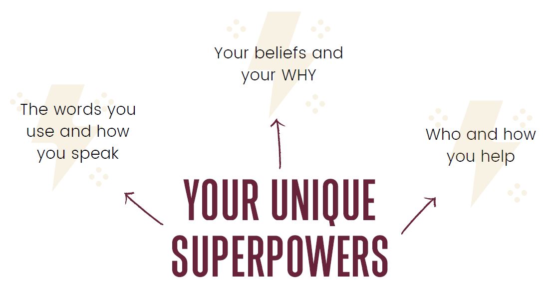
Once you have answers to these types of strategic questions, you will then have a clear picture of the traits and characteristics you want to infuse into your brand. I call them your brand words, and they are made up of personality words, value words, and story words. This collection of words will pop up again in the next phase of the system.
Through your brand discovery, you will also be able to create a clear mission statement for your business. A mission statement is kind of like an elevator pitch. If someone in an elevator asked you about your business, you could quickly tell them who you are and what you do in a sentence or two.
Here are a few example mission statements to get you thinking:
I am a Mind-Body Wellness Practitioner, Transpersonal Hypnotherapist, and Holistic Nutritionist. I guide people in dismantling and rebuilding their belief systems, thought processes, and lifestyle choices amidst inner conflict, clutter, and chaos so they can unwind, rejuvenate, and realign their mind, body, and soul with their deepest and greatest values.
I help creatives keep up with their online marketing by managing their social media or Pinterest account so they can focus their energy on creating amazing products or services without missing a beat with their family.
I am a Certified public accountant who helps small businesses focus on what they do best while I manage their finances. I take care of bookkeeping, financial analysis, and budgeting, providing entrepreneurs with an analysis of their financial information to make informed business decisions and achieve financial goals.
I help overwhelemed online business owners organize their books so they can make and keep more of their money without getting lost in spreadsheets.
Phase Two: Inspire
Now that you have your set of brand words, and are clear on the “why, who, how, and what” of your business, It’s time to translate all of that into something visual you can actually start to work with!
But how on earth do you translate these “intangible elements” into something visual?
Enter the mood board!
A mood board is a visual collage made up of pictures, colors, patterns, textures words, and any other elements that combine to visually represent your unique brand words in a visual way. Often, pictures and imagery can convey feelings and emotions better than simple words can describe.
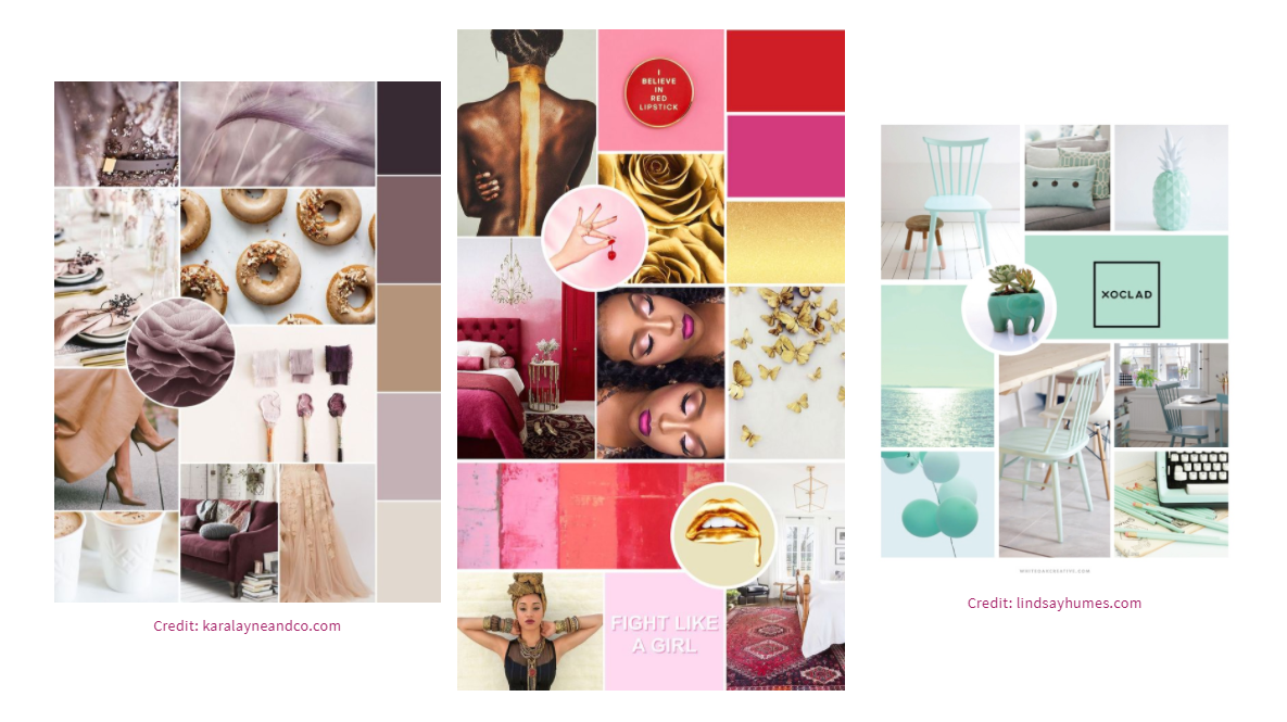
You can create a mood board by gathering 20-40 images from Pinterest and saving them to a secret board. This can be a really inspiring process, and you’ll likely begin to see a visual style forming right before your very eyes! Narrow them down to your top 10 and put it all together in Canva. (There are many mood board templates you can choose from) Canva makes it easy to drag and drop images, zoom in, rotate, and switch things up until you’re happy with the end result.
Your mood board is going to be the guiding light for all of the visual decisions you make as you create your visual brand.
If you’ve ever been trying to do this process without completing any of the pre-strategy work, you likely felt like you were choosing things at random, with no rhyme or reason. Not good! There is a strategy behind choosing all of the visual components of your visual brand.
Every decision that you make during the branding process can be gut-checked with your mood board. Does THIS fit the overall vibe and tone of my brand?
Phase Three: Create
It’s finally time to create your visual brand! I’m sure you are most excited about this part since this is where it all comes together. It’s also the most time-intensive phase of the framework.
Your visual brand is strongly influenced by the images in your mood board and your most powerful brand words. Since your mood board was created based on your brand discovery – it’s the perfect place to find your inspiration! You’re not going to be making these important design decisions willy-nilly! This is pure strategy.
Spending the time to make these very important decisions now will pay off in the time you will save later. You’ll always know what colors to use, what fonts to use and you’ll have carefully chosen stock photos that you can use in any graphic you create. Talk about efficiency!
Here are the elements that will make up your brand image:
-
Logo Trio
Yes, I recommend THREE logos! Here’s why: There are so many places your logo will show up, so having multiple options will come in handy. Shoot for one main logo, a logo mark, and a submark. It’s good to have a horizontal version, a vertical version, and a very simple circle/square icon that you can use as an icon or design element.

-
Fonts
Choose 3-4 fonts that fit the overall tone and vibe of your branding. You’ll need a header font, secondary font, body copy font, and an accent font with some personality. Use these fonts in EVERYTHING you design! Purchased fonts can be uploaded to Canva pro and will ensure that your brand images look unique.

-
Color Palette
Using color psychology, create a color palette that attracts the right people and makes them feel a certain way. Sometimes, you can pull colors directly from your mood board. Five colors is a great place to start. I recommend 2 core colors, 2 neutrals (1 dark, 1 light), and 1 accent you can use for POPS of color for things like call to actions and buttons.

-
Images
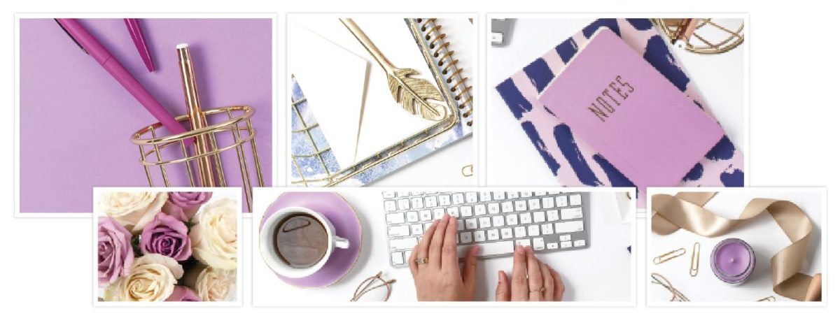
Without images, designing anything for your business would be pretty hard! They are the cornerstone of your graphics. I suggest you find 2-3 stock photo bundles that include close variations of your core brand colors or compliment them very well. Styled stock photos are my favorite, and there are many websites that offer affordable stock photos.
-
Patterns and Textures
Incorporating these will add an extra element of style and consistency to your brand, website, graphics, and visual content, without the need to plaster your logo on everything you create. You can use these as backgrounds and overlays to give your brand image an element of realness.
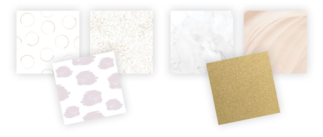
A lot of people going through the DIY branding process can get hung up on making these decisions. I get it! Picking ONE thing and committing to it can be a little scary. But, going through the Discovery and Inspire phases will ensure that you are confident about the design decisions and make the process a whole lot easier.
Phase 4: Implement
Now that you’ve got all of your design elements carefully, strategically, AND intentionally chosen, it’s time to put them to work. The key thing here is that you want to remain consistent at all times, no matter what you are designing for your business.
The implementation phase is an ongoing thing since you will always be creating graphics to market your business. The type of graphcis may change depending on what you are working on, but the idea remains the same.
There are three main areas to focus on in this phase:
-
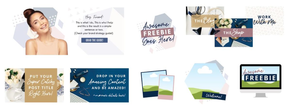
Your website and website graphics
Your website is the HUB of all of your online marketing efforts, so it’s important that it incorporates the foundation of your brand through copy and VISUALS. It’s often your customers/clients/viewers’ first impression of you and your brand. When viewers land on your website, they need to see and feel the essence of your brand and everything it stands for. It needs to be a cohesive reflection of your brand, and not an after-thought.
The MOST important thing is to incorporate all elements of your visual brand intentionally and consistently throughout your website, and the graphics on it. Nothing more, nothing less:)
-
Your lead magnet
A lead magnet is a free piece of content that you give your viewers in exchange for their email addresses. The #1 goal of your lead magnet needs to be to actually provide value, like something that saves people time or money, or shows them a step-by-step process, or provides s quick win. You may be surprised when I say this, but what your lead magnet looks like is equally important as the content inside of it!
Your lead magnet needs to look both professional and eye-catching. Your viewers will see the “cover” of your opt-in freebie long before they see what’s inside, so you need to be sure that it has a good design and looks appealing. AND, you must incorporate of your brand elements into it when you design it!
Your lead magnet also has to have a great-looking cover, since you’ll be using that a lot as you promote it. (If you don’t promote it, your list won’t grow!)

-
Your social media graphics
All of the above isn’t a case of “if you build it they will come”! Now it’s time to put yourself out there through whatever social platforms your ideal customers are hanging out on! Pinterest, Facebook, Instagram, YouTube and Linkedin are some of the most popular, visually-driven platforms. (Pinterest and YouTube aren’t technically social media platforms, but visual search and video search engines, but it’s easier to lump them all into one category.)
First things first, all of your social media profiles should be consistent. Most platforms allow you to upload a profile picture, which should be a headshot of yourself. Use the same image on all platforms! You can also upload a cover image to give your viewers a little more info about your business, how you can help them, or share your current promotion.
As far as your graphics go, you must make sure that you’re using your visual brand elements and paying attention to the design of your images. People are skimming and scanning waiting for something to catch their attention, so make sure they are eye-catching, on-brand, and visually interesting.

So there you go! The four phases of a solid branding + design strategy for creating an authentic brand, cohesive website, and consistent social media presence.
To recap, here’s a breakdown:
- Discover – Discover the unique characteristics of your business and uncover your superpowers.
- Inspire – Bring your brand to life with a mood board inspired by your brand personality.
- Create – Create an authentic visual brand using your mood board as the guiding light.
- Implement – Weave all aspects of your visual brand through your entire online presence. Consistency is key!
If you’re feeling overwhelmed because you don’t know where to start, or don’t feel confident enough to pull this off, don’t stress! You’re not alone. Things always seem hard when unfamiliar.
Branding and Design is a Learnable Skill
Branding + design is a learnable skill, especially when you’re applying it to your own business. It’s totally possible to implement, but much easier if you have a system to follow along with. With the right guidance, it starts to feel easy, and something you actually enjoy!
That’s why I included lots of step-by-step tutorials, video trainings, worksheets, and cheat sheets inside The DIY Brand + Design Framework. If you’re ready to uplevel your visual branding + graphics, I’ll guide you through the whole entire process!
You may even realize that creating graphics is something you look forward to doing!
The DIY Brand + Design Framework is launching on May 21! You can join the waitlist here.
Liked this post? Share the love and pin your favorite image for later!

Nice post. I learn something more difficult on completely different blogs everyday. It would all the time be stimulating to learn content from other writers and apply slightly one thing from their store. I’d want to use some with the content on my blog whether you don’t mind. Natually I’ll provide you with a link on your web blog. Thanks for sharing.