 As a blogger, you know darn well your job doesn’t stop at creating kick-ass content. In fact, that is only a small piece of the puzzle for running a successful blog.
Along with cranking out articles and other helpful goodies, sharing them on social media and networking with other professionals in your niche, it is your job to make blog graphics that stand out online, get more social shares and make you look like the professional that you are.
It’s up to you to make blog graphics that grab people’s attention in a matter of seconds. Your potential viewers decide whether or not they are interested in what you have to say in less than five seconds.
There’s no question about it. You KNOW you need to make blog graphics… But where the heck do you even start?
Creating blog graphics and visual content doesn’t come easy for everyone. Chances are, you probably feel like you aren’t creative, or you don’t have an eye for design – or maybe you’re intimidated by the software. I want you to know that this is super common. These are the top concerns that students in my design mini-course and my design feedback Facebook group complain about.
“I don’t know where to start when it’s time to create blog graphics.”
When it comes time to make blog graphics, either you love creating them or you loathe creating them. Regardless of where you fall, I think we can all agree on one thing: If you want to stand out online, get social shares and be taken seriously, stand out blog graphics are a MUST HAVE. As in, your blog might even flop without them. If you don’t believe me, check out this article published by Buzzsumo.
P.S.! if you haven’t enrolled in my free mini-course do that now! You’ll learn 10 easy to implement graphic design tips that will have you designing better blog graphics right away! Click here to Enroll.
Even the most skilled designers struggle with getting started sometimes. Heck, I’ve been designing for about 15 years now and I STILL sometimes get stuck on where to start. Designing doesn’t always come easy, sometimes you need a little inspiration or a push in the right direction.
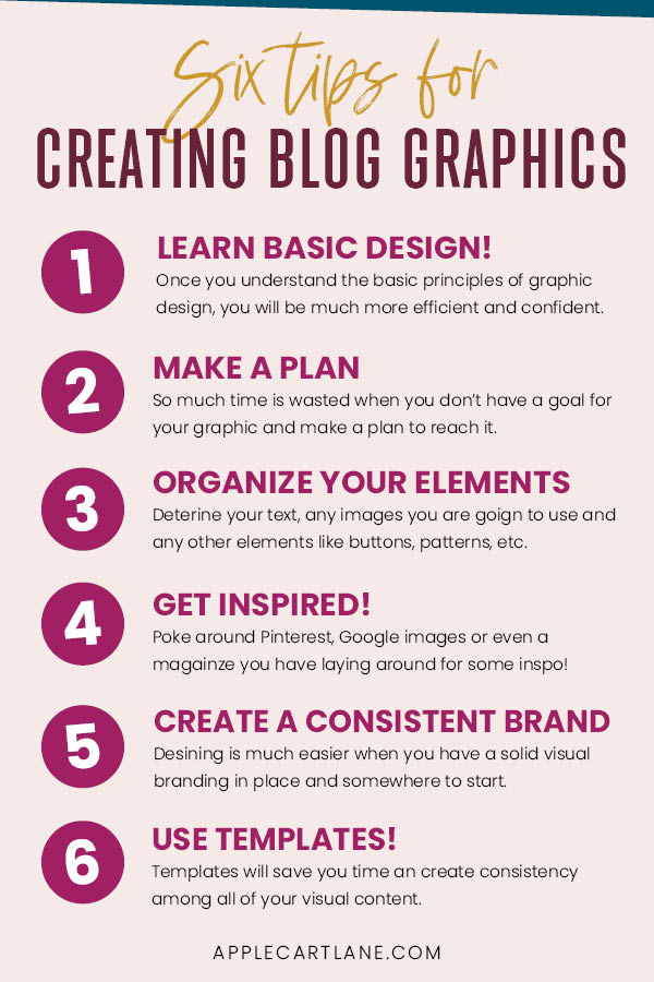
So here I am right behind you, to give you that little push that you need to get started. I’m going to share with you a few tips (in no particular order) that will make it easier for you to make blog graphics that work harder for you. You know, those ones you have in your head but can’t seem to get on screen.
1. Learn Some Basic Design Skills
Sometimes when you are so overwhelmed you just don’t even want to get started; let alone, know exactly where to start. When it comes time to make blog graphics and other visual content, do you ever just freeze up and literally get stuck? That’s probably because you don’t have any knowledge of how to design. If you could just learn a few skills, understand what NOT to do when designing and gain a little confidence, you’d most likely be much more comfortable opening up that blank document and getting started designing.
This is exactly what you will receive when you enroll in my free design mini-course! I’ll teach you ten simple graphic design tips that will give you the confidence you need to design those beautiful graphics you see in your head. I can’t wait to help you get started with basic design; it’s such a crucial part of this blogging journey we’re on together.
2. Have a Goal and a Plan
If you’re stuck staring at a blank document, chances are you don’t have a clear goal. When you’re creating graphics, your primary goal is surprisingly not to make something that looks pretty. It’s to get a specific message across. To get someone to do something, to take action. Do you want someone to click to your post? Sign up for your email list? Watch a video? Purchase a product? Every graphic has a purpose; a goal. So before you start designing your next graphic, you need to know why it exists in the first place. Once you know the answer to this, you have something to work towards.
Once you know exactly why you’re designing something, it is much easier to get started. Think about it…. How can you work towards a goal that you don’t know exists? Close out of that design program, take a step back and figure out exactly why you’re doing what you’re doing in the first place.
When you know the answer, you’ll have a much clearer focus. Suddenly, you’re not just trying to create something pretty. You’re designing to tell a message.
3. Determine What Elements You Have to Work With
Often, we jump right into trying to whip up a design without a plan. This is one of the biggest mistakes you can make if you struggle to get started. There is nothing worse than staring at a blank document and not having a clue what to fill it with. I encourage you to take a step back and consider exactly what you have to work with. Some graphics may be simpler than others and just have an image and some text. Other graphics might be a bit more complicated with more elements that you have to think about. Either way, take a few minutes to think about what elements are going to be part of your design.
You can jot them down on a piece of paper, sketch a little something out or loosely place them on the workspace of your design program. Once you have an idea of what information is needed for your graphic, you can then plan your design in a way that you will make sense to your viewers. Most of the time, you know in your head how your message is to be digested, so this should not be too difficult.
This process might look something like this…
Let’s say you are designing a cover graphic for a Facebook group you are creating. You have the name of your group, a description, your logo, a call to action, and your name and URL. But how do you organize them?
For this particular graphic, you might end up with four different groups of elements:
- Title and description
- your name and URL
- your logo
- Call to action
Since you know how you want your message to be read, its time to consider the message from your viewer’s perspective. What path do you want them to follow? What do you want them to take away from your design? What action do you want them to take? Organize and group your elements and information while providing adequate spacing so there is no question what goes with what. Don’t just place bits of text here and there and hope for the best.

4. Get Inspired!
Find good design and learn from it!
I recommend creating a Pinterest board And pinning eye-catching and well-designed pins to it as you see them. Chances are you’re already spending quite a bit of time on Pinterest so that should be easy. When you need some inspiration, head over to your Pinterest board and go from there. Once you replace the images, colors and switch out the fonts and headline it will be an entirely different pin, and nobody will know where your inspiration even came from!
5. Solidify Your Branding, Then Stay on Brand
Not only does branding your blog help you stand out online and become more memorable, but it also streamlines the image creation process.
When you don’t have to think about what fonts or colors to use designing blog graphics suddenly becomes much easier.
Consider settling on a set of colors and fonts and decide on the style of images that you’re going to work with. Do you have Pinterest pins that have more engagement than others? Do you have a social media post that got a great reaction from your audience? What kind of style is your audience into? Take all of these things into consideration as you decide a cohesive look and feel for your graphics. Don’t just pick out what you like- think about what will resonate with your audience. Once you have some brand standards, half of the work is already done when you need to make blog graphics for your latest project. You’ll basically just be switching out images and headlines for each new graphic you create.
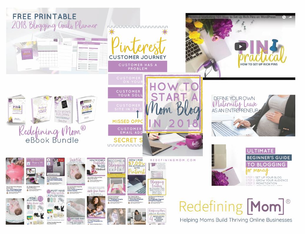
My friend Monica, from Redefining Mom is a perfect example of what to strive for when creating branded graphics. Notice how all of her images look like they came from the same place. All of her graphics use the same colors, fonts and overall style.

6. Create and Use a Set of Templates
Templates are one of the biggest time savers for me when it comes time to make blog graphics. I am usually able to create everything I need for a post in less than 20 minutes.
So how do you create a set of templates you can use over and over again? Gather all of the images you commonly use and create a file for each one. You can also start with a copy of an old graphic. When it’s time to make a new graphic, all you have to do is switch out text, image, and Boom! You have a brand new blog graphic in half of the time.
Check out this article to see the 7 types of templates you need to create for your blog.
Templates will not only save you time, but it will also help keep your look and feel cohesive since you will be using the same layouts and elements from previously designed graphics. I cannot stress how much time I save using templates!
So there you have it. Some tips for getting past that blank canvas syndrome you might be suffering from! I hope this gives you that push you need to make blog graphics that are as amazing as your written content.
I can’t wait to see what you create!


