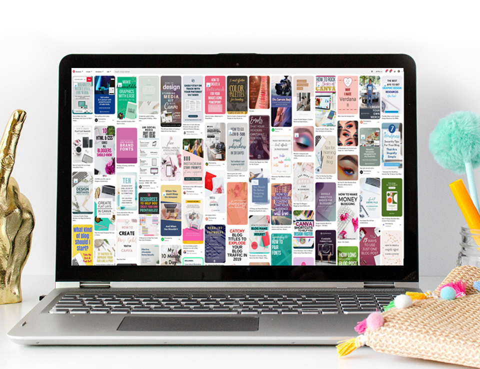
 Pinterest can be a bit frustrating. It can start to be pretty overwhelming when you are trying to keep up with all of the fresh pins you need to create and sift through tons of information about keywords. You know people have to be seeing your pins…. But why aren’t they clicking into your content?
The reason usually boils down to one thing – you aren’t using headlines that attract your customer. The words on the pin and in the title have to grab your viewer’s attention, get them to actually read your pin, and finally, make them click.
That’s a lot of pressure we’re putting on a handful of words! But don’t worry, I have some Pinterest headline tips to help you connect with your reader and get those link clicks you’ve been missing.
Where does your headline go?
First things first – let’s take a moment to understand what we mean by a headline, and where it goes.
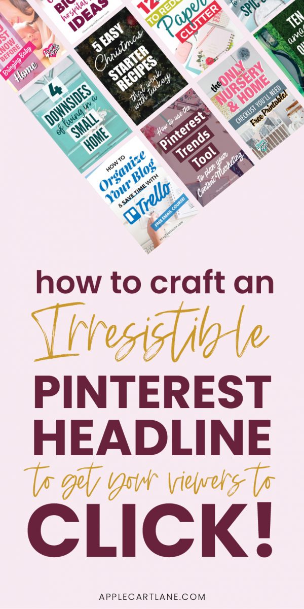
There are two places you can use a headline. The first one is on the pin itself – Pinterest can understand words on a pin so it knows what the pin says. And particularly on mobile, people see the image more than anything so those words are super important.
The other place is the pin title. This is a bit newer but also really important. It’s the bit that appears at the top of the pin information section and sometimes under the pin on the Home Feed.
Does your headline need to match your blog post?
You’ve worked hard to craft the perfect headline for your blog post, right? And you should definitely use it on your first pin to get the most out of it. But not every pin to a post needs to have the same headline or title.
It’s actually a good idea to vary these. And to take it one step further – your headline on the pin and your Pin title doesn’t need to be the same either! You can use one headline on the pin and another on the title as long as both are accurate and relate to what’s in the post. #mindblown!
I share a TON of Pinterest headline tips (and so many more pin design tips!) in my free on-demand Pin Design Workshop!
If you want to really up-level your Pinterest strategy, this training is going to put you on the fast track to creating beautiful pins that actually convert.
And you can watch it right now! (No waiting for a specific time that you can’t commit to.)
6 of the BEST Pinterest headline tips
Now that you know where the headline goes and a few basics on using them, let’s dive into some Pinterest headline tips to help you create better headlines for your pins.
Make the headline clear and readable
This one relates to the headline you add on the pin itself. One of the biggest mistakes I see is that people include words but you can’t read them. A few reasons for this might be:
- The font color is too similar to the background color
- The words can’t stand out against the background image
- The font is too small
- The font is a script font that’s hard to read
Don’t get me wrong, I love a good script font. But you need to be very picky about the fonts and color combinations that you use when you create headlines on your pins.
Not only does there need to be a clear contrast but you also want to avoid those color combinations where the words become a bit weird and blurry. This happens when the colors aren’t different enough.
Include keywords and buzzwords
There are two types of words that you need in any headline, whether that’s on a pin, a title, or a blog post. One is keywords and the other is buzzwords.
Keywords are the signposts that Pinterest and search engines use to understand what your content is about. You’ll do your keyword research on Pinterest before you write your post so you’ll know what they are. Don’t be afraid to use different versions of the keyword in headlines on pins and in the title.
Buzzwords are words that grab people’s attention and increase click-throughs. We do see them in clickbait-style headlines but these can work – remember, it is only clickbait if the article doesn’t deliver on the promise of the headline. If you promise ‘10 amazing tips’ and have at least that many, you are okay.
A few simple examples of buzzwords can be:
- Free
- Easy
- Proven
- Secret
- Imagine
Don’t go nuts with them but if you can incorporate these and other buzzwords, your headline will be more attention-grabbing.
Add value with a subheading
On your pin, there’s nothing that says you have to stick to just the headline – you can also add a subheading too.
Subheadings can be short sentences or even a series of words that sit under the main headline. They will be smaller in size than the headline so they don’t overwhelm it. But they add information to the pin or can be a call to action (CTA) that urges people to click.

Incorporate visual hierarchy
We’ve mentioned a little about using different size fonts for headlines and subheadings. But you should also use it for your headline itself.
Every headline will have a word or two that’s more important than the others. But if the whole headline is the same size and color, it’s harder to spot what they are. Highlighting the most important words with different colors and sizes is what’s known as a visual hierarchy. The eye sees them first and that’s important.
Even using the same font but making the most important words bigger can be perfect. Or if you have a script font that’s easy to read, use it for one of the focus words. Make sure it is nice and large!
Tell your viewer what is in it for THEM (it’s not about you!)
We’re all very busy and that means we only click things that have some benefit to us. That’s why your headline needs to be about them, the reader, not you.
Sometimes it is as simple as using ‘you’ and ‘your’ in the headline. Or you can call out the person who should read the post – the struggling mom, the new business owner, the experienced blogger. By seeing themselves in the headline, your reader will instantly relate to it.
Lead to helpful, interesting, or informational content
The last point about the headline is that it needs to lead to content that’s interesting, informative, or helpful. People need to feel like they got something from your post, whether that’s a solution to a problem or just something that makes them smile.
It isn’t about the length of content but the quality of what you include. A recipe post can be informative even if it’s short because it gives the reader everything they need to make that dish. And the content should always deliver on what your headline promises.
If you loved these tips, you don’t wanna miss my free on-demand Pin Design Workshop, where’ you’ll learn:
- The basics of Pinterest pin design
- How to increase your recognition and visibility
- Designing the PERFECT Pinterest pin (Lots of headline tips in here!)
- Tips for standing out and looking unique in the feed
- How to save massive time creating pins
Save your seat right here! Oh, and you can watch it right now! (No waiting for a specific time that you can’t commit to.)
Creating the best Pinterest headlines
If you make use of these tips, you’ll quickly be creating Pinterest headlines that will grab your audience’s attention and get them to click. So not only will your gorgeous pins get noticed but your blog will get traffic!
I can’t wait to see what you create, and don’t forget to sign up for my free ON DEMAND Pin Design Workshop, The 5-Part Pin Design Formula!


Usetrete stovky az tisice korun na sve pravidelne lecbeopravdovalekarna.cz