Is your Pinterest pin design less than amazing?
Are you beginning to worry that the Pinterest images you create might actually be hurting your Pinterest success?
Are you kinda freaking out at the latest update from Pinterest themselves: “We (Pinterest) want fresh content from creators.” (If you’re marketing yourself on Pinterest, that’s you!)
What in the heck does Pinterest consider “fresh content”, anyhow?
Simply put, “fresh content” is a brand new Pinterest image. The image can link to any content, old or new.
This makes complete sense, and here’s why: Pinterest wouldn’t be the exciting, engaging, and inspiring platform we’ve all come to know it as if content creators weren’t pinning new content! If a Pinterest user kept seeing the same pins over and over, they’d likely not return.
[disclosure]
What Makes a Good Pinterest Pin Design?
A well-designed pin will include an aesthetically pleasing layout paired with a strategic marketing message. This combination will help you connect with your viewers while helping them see how you can solve a problem they have in their lives.
I get it. Designing pins can be frustrating, and it doesn’t always come easy. Especially if you don’t feel like you have that natural “eye for design.”
With a little guidance and some simple graphic design tips, you can absolutely create click-worthy, scroll stopping pins that get your viewers to take action (aka click your pins!).
Because Pinterest is a visual search engine, the way your pins look is critical for your success on the platform. Here are 53 well-designed pins for your inspiration.
Even if you have the best content in the world, if the pins you design for that content look unprofessional and don’t get your viewers to do exactly what you want them to do (click your pins.) they aren’t going to work. Period.
Free Pin Design Workshop
I love this element of any Pinterest strategy SO MUCH, that I’ve created a free on-demand Pin Design Workshop just for you! If you want to really up-level your Pinterest strategy, this training is going to put you on the fast track to creating beautiful pins that actually convert.
And you can watch it right now! (No waiting for a specific time that you can’t commit to.)
Alright – on with the show!
Here are ten Pinterest pin design tips to help you get started creating scroll stopping pins that will grab your viewers attention:
1. Start with a Plan
One of the most overlooked steps when designing anything – not limited to Pinterest pins – is planning out your design.
I get it. You just put the finishing touches on your blog post, and you just want to quickly create some graphics so you can finally hit publish and get your content out there.
But before you even begin to open up that blank document…
You need to make a plan.
Planning your pins won’t take too much extra time, but it will save you time designing. Instead of opening up a blank canvas and placing elements here and there the moving them around over and over again not quite getting anywhere, you’ll open your document and have a much better idea of where to start.
I promise you that if you spend even two minutes to think out your design before you start haphazardly placing elements on your document, you will be designing quicker and more intentionally every time.
2. Learn Some Basic Graphic Design Do’s and Don’t
If you want to look and feel professional from a visual standpoint, I highly recommend you spend some time learning some basic graphic design skills.
There are fundamental design principals like composition, hierarchy, contrast, and balance that you need to understand when you start designing Pinterest pins.
Following these very basic design principles and rules will help you design eye-catching pins that your viewers are drawn to.
Enroll in my Free Graphic Design Training and Learn the basic design principals and ten common design mistakes you’ll want to avoid!
Making common design mistakes will make your work look unfinished, like you don’t know what you are doing. Spending a little bit of time learning basic principals of graphic design can go along way in the success of your blog and your ability to create professional DIY graphics and other visual content.
Here are the 12 most common Pinterest pin design mistakes you’ll want to avoid
3. Design Pins at the Preferred Pinterest Pin Size
The most fundamental part of pin design starts with the size of your pin. Get this wrong, and you risk your pins not showing up in the feed correctly. Nail it, and you’re well on your way to making Pinterest happy and attracting your dream audience.
So, what is the ideal Pinterest pin size?
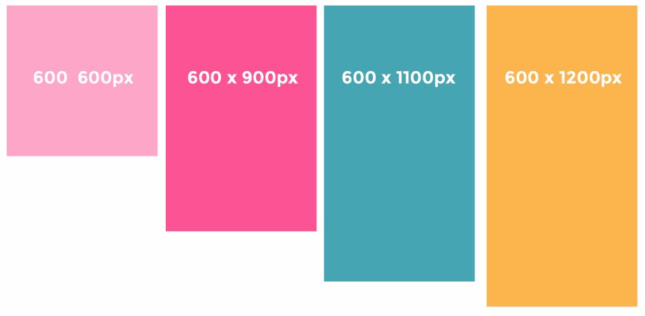
Pinterest has stated that the ideal pin size is 600 pixels x 900 pixels.
You can make longer pins if you want, but they may get cut on in the feed. in her article, How to Use Pinterest, Suzi from startamomblog.com shares this interesting tidbit:
“The maximum pin size you can do is 600×1200 pixels. However, if someone is searching for chicken recipes and there is a pin that is 600×900 and one that is 600×1200, the larger pin is taking 30% more space on your screen. For the longer pin to show up first in the results it has to have 30% more engagement than the smaller pin.
Make sense right? Basically, you have to earn the real estate space. It makes sense to create both a 600×900 and 600×1200 pin. And don’t be afraid to try out square pins too.”
Suzi Whitford, Start A Mom Blog
4. Use Only the Best Imagery
There are a few background options when it comes to your Pinterest pin design.
You can leave it white, use a flat color background, throw a pattern on it, or go with the most popular option, which is a photo.
If you’re any good at snapping decent photos, you may be able to use your own. If you’re like the rest of us, you don’t have that kind of skill, so you will probably need to take advantage of stock photos.
Don’t always settle for free photos, as most of those are overused and have made their rounds. My favorite websites are IvoryMix and Unsplash for high-quality stock photos that will really make your pins stand out.
 Make sure you follow these tips when searching for the perfect stock photo:
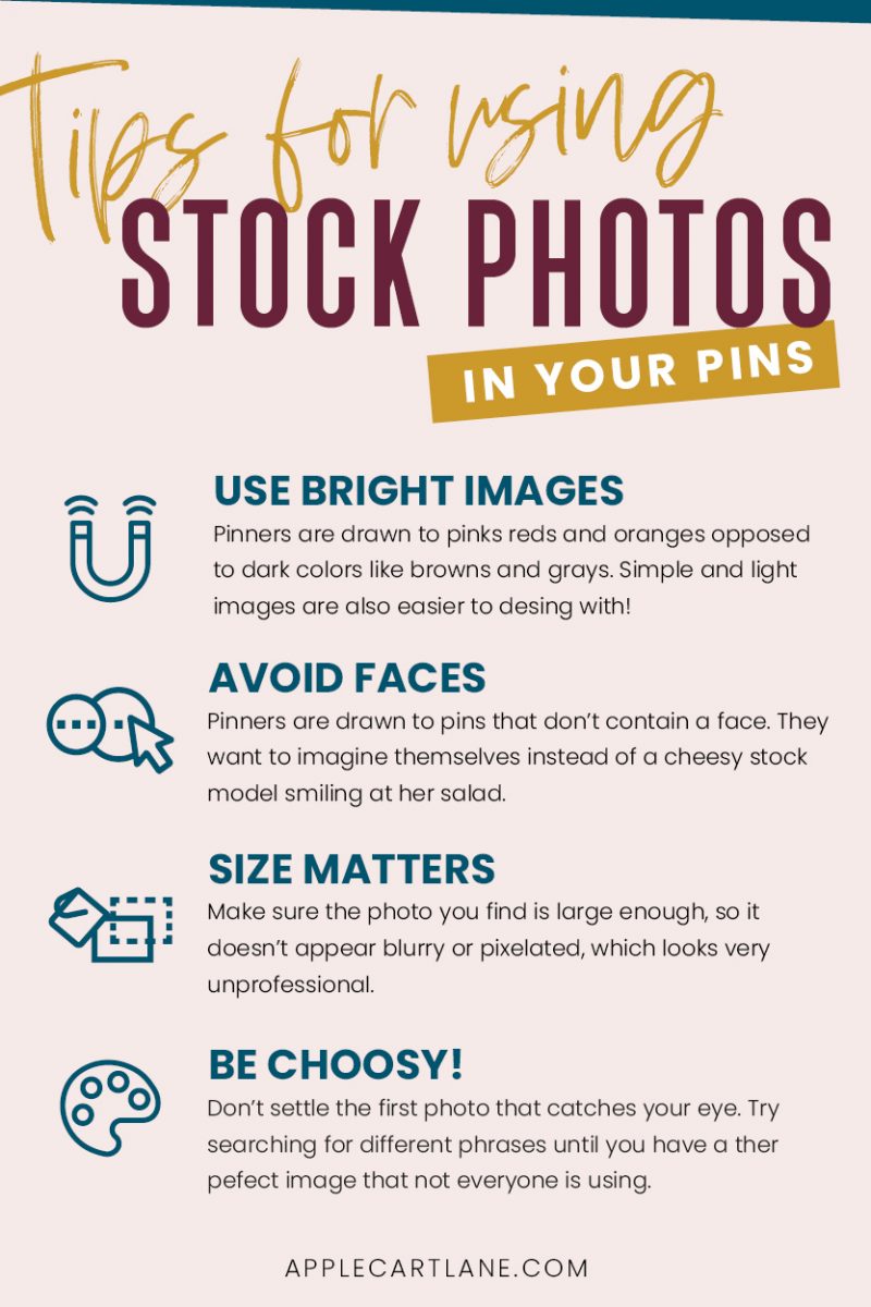
- Look for brightly colored pictures. I’ve learned that pinners are drawn to pinks reds and oranges as opposed to dark colors like browns and grays. Images that are lighter and simpler are usually easier to work with than busy images with lots going on.
- Avoid faces. Although they don’t bother me, pinners are drawn to pins that don’t contain a face. This way, they can imagine themselves instead of a cheesy stock model smiling at her salad. I will mention that I’ve seen some super successful pins that have faces, so it all depends on your audience. Test the waters!
- Size Matters. Make sure the photo you find is large enough, so it doesn’t appear blurry or pixelated, which looks very unprofessional. If you’re cropping or zooming in, be extra careful! And most importantly…
- Be choosy! I love sifting through stock photos to find the perfect one for my pin. Don’t settle the first photo that catches your eye. Try searching for different phrases until you have a winner.
Think of all of the creative ways you can use the photo in your pins and even other graphics. Can you zoom in on a coffee mug or a set of hands? Can you possibly use the background of the photo for a texture somewhere else? This gives you lots of options for using the photo more than once and forces you to create some repetition in your images.
Here are 11 creative ways to use stock photos in your Pinterest pin designs.
Also, don’t just pull a photo off of Google images and think you can use it, either. That’s illegal, and you can’t do that.
Check out this article, from The She Approach, for 30 places to find free and cheap stock photos for your blog.
5. Craft a Strategic, Easy to Read Headline
Once you have your perfect stock photo in place and your branding in mind, It’s time to focus on the next most crucial part of your Pinterest pin design.
The best headlines:
- Reveal a benefit
- Are specific
- Include keywords
- Include a Number
- Provide a solution
Basically, your headline needs to quickly tell your viewer exactly what is in it for them and how you are going to solve the problem that they have. Basic marketing, really.
Once you’ve decided on a catchy headline, make sure that all of your text is easy to read. Avoid tiny fonts or fonts that are so scripted that you need to decode. Choose a font that people will be able to read as they quickly scroll through their feed, like a bold sans-serif font.
6. Create Visually Consistent Pins (aka Use Your Branding!)
With millions of active pinners, you’ve got less than a second to make an impression on your audience. Did you know that It takes the average person seeing you three to seven times to start recognizing you!
What does this mean?
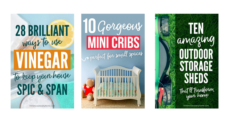
Your pins need to be cohesive. Use the same fonts, colors, image styles, textures, and design elements for your pins.
Utilize the last 50-100 pixels at the bottom of your pin to make sure you include your website name or even better, your logo. Inject your brand into your pins by using color overlays, blocks of color under your text, fonts, and even the textures of your brand. All of these things come together to form some repetition that will have you standing out on Pinterest in no time.
Check out Olyvia.co’s Pinterest board for her business. She does a fantastic job with pin branding. She sticks with bright colors, the same font, and in most cases, she drops her logo down at the bottom, so people recognize her wherever she shows up on Pinterest.
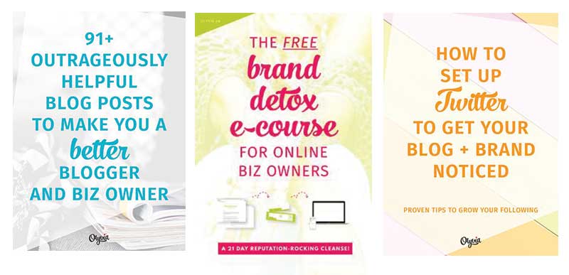
Utilize the last 50-100 pixels at the bottom of your pin to make sure you include your website name or even better, your logo. Inject your brand into your pins by using color overlays, blocks of color under your text, fonts, and even the textures of your brand. All of these things come together to form some repetition that will have you standing out on Pinterest in no time.
This article from alyssa.ink is an excellent resource if you want to learn more about how to brand your Pinterest pins.
What about off-brand pins? Create these too! Since you should be creating anywhere from 3-5 pins per article, you can play around with different styles and how your audience reacts to them on Pinterest. Showcase your branded pin in your post, but feel free to upload some off-brand pins directly to Pinterest and do some a/b testing.
You never know which pin might take off!
7. Make Your Pins Look Unique
There’s nothing worse than creating pins that look like everyone else’s. This is a common issue you might have if you are purchasing templates and not modifying them to fit your own unique brand.
Your pins need to have something that piques the interest of your viewers and draws them in. A pin that looks like every other pin out there will blend into the crowd. Add in your unique brand elements, patterns, and styles.
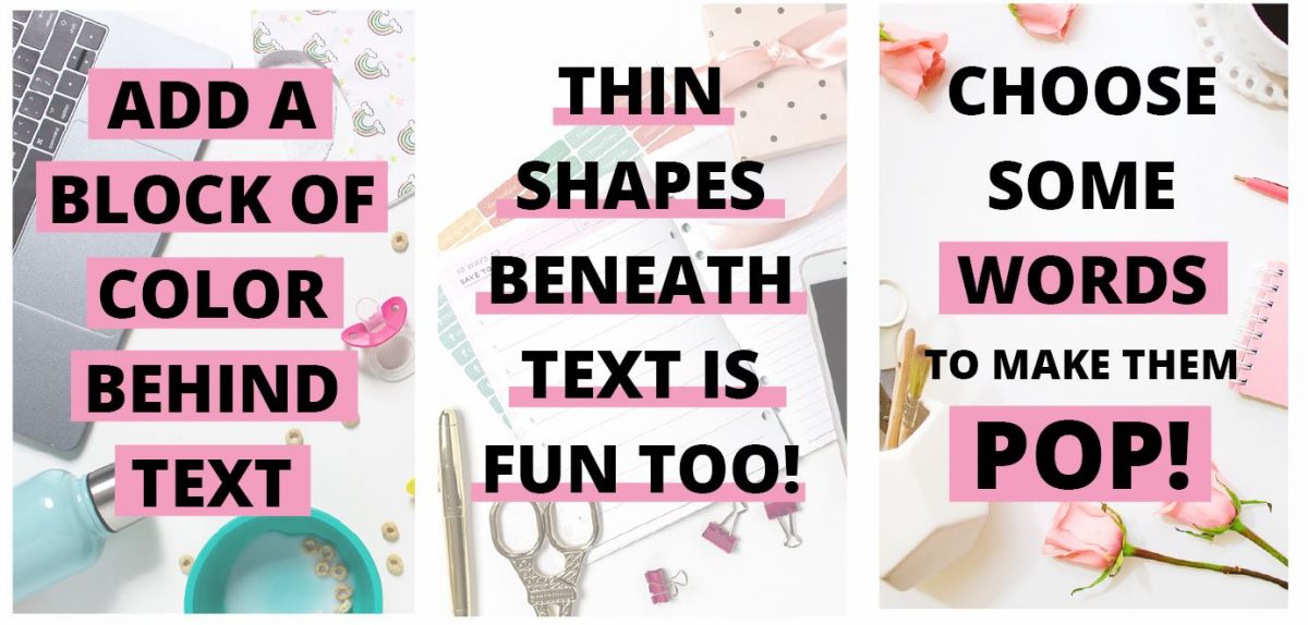
This could be something as simple as adding a blog of color behind some text to make it pop. Play around with layering, overlays, shapes, and gradients to ensure your pins have that unique flair that sucks people in. Here’s a process that will help you find your unique Pinterest pin design style.
8. Make Your Important Stuff Stand Out
Hierarchy is a design term that means making things more important than others within a layout. It’s important because it helps your viewers know where to look first, second, and third. Many pins don’t take advantage of this simple design hack that can really help your pins stand out in the feed. Similar to contrast, size, shape, color, and space can help you create a hierarchy within your Pinterest pin designs. Especially if you can effectively draw attention to keywords, your audience may be searching for.

Quick Tip: Before you start designing, assess what you have to work with. What is the most important part of your message? What keywords might someone be searching for that you could put a focus on?
To create visual hierarchy, consider using a different font for certain words or phrases. This is your way of directing people to see exactly what you want them to see on your pin.
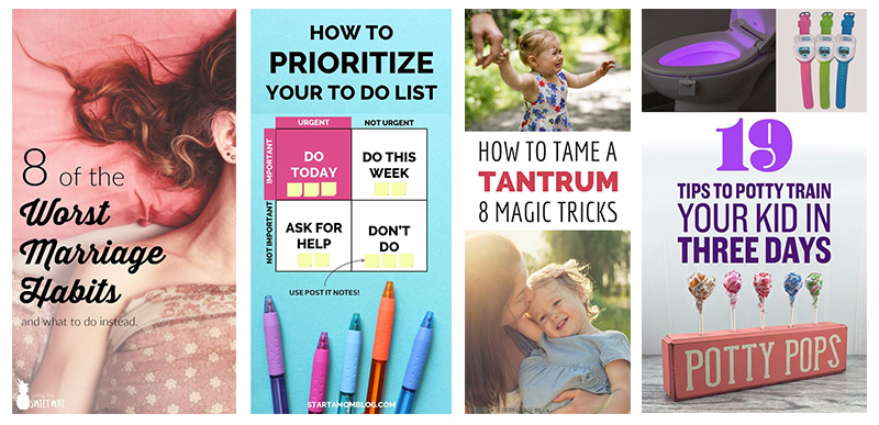
It’s best to stick with no more than two fonts for your Pinterest pin design. A font that has a few different weights works well because you can play around with what you want your readers to see right away, without using tons of different fonts.
9. Keep it Simple
When designing anything, less is usually more. If you try to cram too much information on your pins, your viewer will be overwhelmed. Pinners don’t want to have to think much when browsing the platform. They want a crisp and clear message that they can jump into or move on.
Make sure that your images are not too distracting, and that you’re not using way too many. (Unless you’re putting together a collage pin that showcases a how to process or a round-up.)
Remember to make your headline short and sweet and not confusing. Too much info will cause your viewer to scroll right past instead of reading all of those words.
Don’t add unnecessary design elements that distract from your messaging. Only add elements that support it and help with readability.
10. Don’t Forget a Call to Action
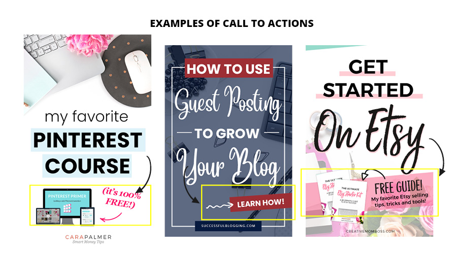
Your viewers don’t know what you want them to do unless you tell them to it! To make clicking your pin a no-brainer, add a solid call to action to the bottom third of your pin design. Use action words like “download now!” or “click to read more.”
If you’re working on growing your email list with an opt-in freebie, free challenge, or free course, adding a mock-up of your digital product along with your call to action is a great list building strategy.
Notice how the pins below visually show that there’s something more for the reader? So, show off that pretty opt-in of yours!
How to Create a Pin for Pinterest
Once you know what makes a good pin and all of the mistakes you need to avoid when designing, you can get to the fun part of actually creating your pins!
You can use a free design software like Canva to design your pins. Canva is perfect for DIY designers creating visual content since there isn’t a huge learning curve like there would be with more advanced design programs.
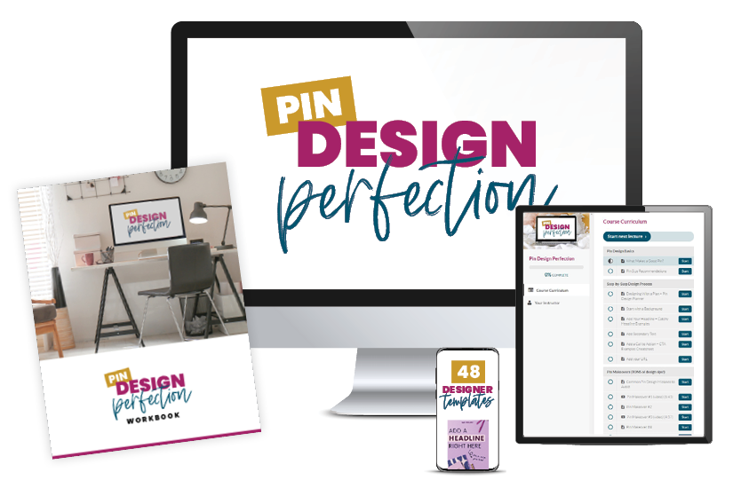
if you couldn’t tell by now, Pinterest pin design is something I am passionate about. Pinterest has totally changed my life and brought me to where I am now – running my own online business and impacting the lives of so many people. If you’re ready to jump all in with your pin design, check out my signature course, Pin Design Perfection.
In Pin Design Perfection., you’ll learn every single thing you need to know to design traffic-generating pins. It will transform your Pinterest strategy and you’ll have the confidence you need to finally create pins that you’re proud of!
Should You Use Pinterest Pin Templates?
This is a tough one – and like all things, there is a time and a place. Templates are convenient since you don’t have to re-invent the design wheel every time to create pins. If you want, you can invest in a set of pre-designed Pinterest templates as a starting point for your pin creation. Here’s the kicker tho – other people are likely using the same exact templates as you are. That is why it is SO IMPORTANT for you to change out the images, fonts, and colors to match your unique branding.
The best templates are fully editable in user-friendly software like Canva, making it easy to create 100% unique pins that get your viewers to take action.
Your best bet is to create your very own set of Pinterest pin templates that you can use to quickly create pins when you need them. (Something you’ll learn how to do in Pin Design Perfection!)
If you’re itching to push your content out on Pinterest ASAP, check out my shop for some pre-designed pin templates that will get you started.
You Don’t Have to Dread Pinterest Pin Design
You don’t have to be a professional designer, or even have an “eye for design” to apply these fundamental rules of Pinterest pin design. These tips are ironically the tip of the iceberg when it comes to Pinterest pin design. You have mere seconds to catch your viewers attention and stop them in mid-scroll.
Remember, an effective pin will include an aesthetically pleasing layout paired with a strategic marketing message.
I can’t wait to see what you create, and don’t forget to sign up for my free ON DEMAND Pin Design Workshop, The 5-Part Pin Design Formula!




These are some kick ass tips. I especially liked the call to action but! Thanks!
Thanks, Karen! I hope you can implement some of them and watch your traffic increase!
Love these tips.
I’m always working on my Pin graphic design – shorter pins, serif fonts, longer pins, bigger font, colorful letters etc..
I like seeing which pins resonate and tweaking my pinning strategy!
I think branding your pins design is a good idea, but don’t be afraid to do off-brand pins. You never know – they make take off and become viral!
Great tips, Elna! I love the idea of testing out some off brand pins!
I really enjoyed reading this post and if you have like a pinterest growth course i would very much like to purchase it…
Hey Newton! Glad you enjoyed the post.
My course Pin Design Perfection will teach you everything you’ll ever need to know about designing pins for Pinterest! http://applecartlane.com/pin-design-perfection/
Really Appreciate this post, can you make it so I receive an email when there is a fresh post?