 It’s frustrating. The second you think you’ve got this Pinterest thing down… Algorithm change! It seems like the end of the world, doesn’t it? One day you’re on the up and the next day, your traffic has plummeted.
Wouldn’t it be nice if there was a way to level out your Pinterest strategy? If you could bring up the baseline of your account metrics as a whole, you’d be able to manage the spikes and those dreaded dips that happen when Pinterest runs an update or changes the algorithm.
[disclosure]
Is Your Pinterest Strategy Missing This Key Component?
Well, friends, I’m here to let you in on a little secret. There is a constant on Pinterest that you might not have considered.
Ready?
It’s your Pinterest Pin Design.
Have you ever considered how important it is for your pins to look good? When I say look good, what I really mean is that they need to look better than every other that shows up for your targeted keyword or in your viewer’s smart feed.
They need to be designed intentionally if you want your viewers to click.
So why exactly is the design of your pin a crucial component of your Pinterest strategy?
REAL TALK. nobody wants to pin an ugly pin. There are likely hundreds of pins that rank for the same keywords you’re attempting to rank for. You HAVE to out-design all of those other pins. Your Pinterest strategy depends on it, especially when you’re counting on other bloggers in your niche to repin your content so that it spreads like wildfire.
Free Pin Design Workshop – Save Your Seat!
I’ve created a FREE pin design workshop that you can watch RIGHT NOW! The 5-Part Pin Design Formula is a MUST-WATCH if you’re ready to up-level your Pinterest pin design and overall Pinterest strategy.
All you have to do is register for the free workshop and I’ll send it straight to your email and you can watch it right now.
Beautiful Pins are Key for Your Pinterest Strategy
Beautiful pins are the secret sauce when it comes to your pins getting noticed and clicked.
Since Pinterest accounts for a majority of most of website traffic for those who are using it, I think it’s safe to say that you better be spending some quality time working on the visual aesthetic of your pins.
Graphic design mistakes are floating all over Pinterest; don’t let your pins fall into that category of unprofessional. You are a professional in what you do – make your pins reflect that!
Your viewers determine whether or not they are going to click your pin within a matter of seconds, and it’s not always easy to ensure they do. Especially when you’re not a designer and have no idea what looks good.
The good news is, is that I wanna be your newest designer BFF who can help you design the kind of pins your viewers can’t help but click.
Alright, so while you’re waiting for the workshop to be delivered, read on for some simple pin design tips that you can put to use in your next set of fresh pins.
High Contrast
Contrast is critical when it comes to designing effective Pinterest pins. Why? Because you want things to stand out. In a sea of pins flying by in a matter of seconds, how are you going to make that finger stop swiping? Make sure your text is readable on your background image Is Choose a readable font. Use color, shape, size, and space to create contrast within your pin. If you can make your pin stand out with contrast, you have a much better chance of being noticed, and more importantly, repinned.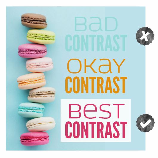
Clear Message
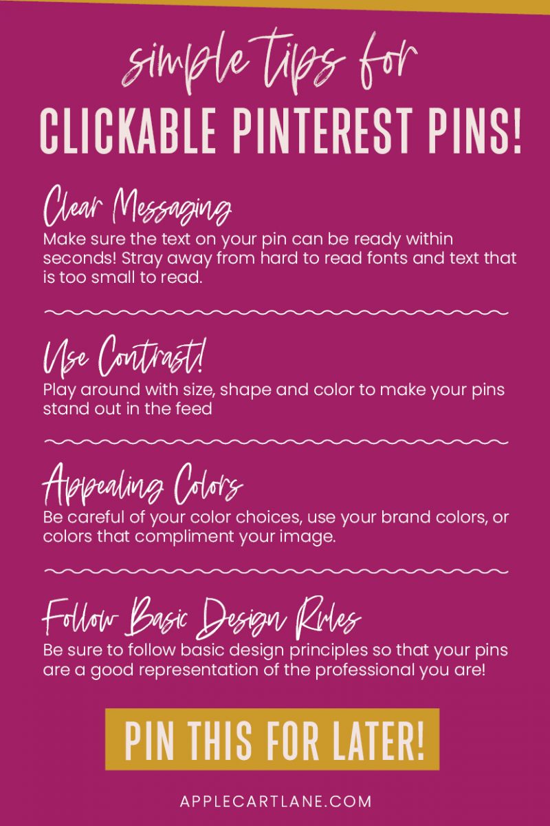
First things first, your message better be able to be read immediately. Keep relevant text together and separate things that aren’t relevant. For example, put all of the words in your headline together, so they are read as one.
If you are using a subheading (a bit of text to give a few more details about your article) keep that near the heading. The two go together, so make sure they are somewhat close to one another.
If you have a call-to-action on your pin with an image or another element, place those together. Make sure they are far enough away from your heading so that the viewer is clear on what’s what.
In design terms, this is called proximity. Group related things together and keep groups of things far enough apart. This principle can be applied to any blog graphic or layout you create, not just Pinterest pins.
Fantastic Photos and Images
Images make up more than half of the visual interest of your Pinterest pin. Without images, your message would be prettttty boring, wouldn’t it?
Images in design are used to evoke feelings and emotions that make your viewers connect with you; so make sure you hand-pick them carefully. You want to make sure that they are high enough quality and large enough for your pin.
Invest in stock photos from a website like Creative Market. They offer six freebie design elements a week, all you have to do is sign up for their weekly mailing list and you’ll get all of the freebies right to your inbox. I love to open my inbox on Mondays to find free and usable design elements!
Related: 11 Creative Ways to Use Stock Photos in Your Blog Graphics
Great Design Aesthetic
Even if you’re not a designer, that doesn’t mean that you don’t need to follow some basic graphic design principles. Learning some basic skills can go a very long way in the professionalism of your Pinterest pin design. You don’t need to have years of design experience or extensive knowledge of design theory to produce pins that stand out and look great.
Appealing Colors
I’m sure you’ve seen an ugly pin or two in your Pinterest life. One of the most common design mistakes that I see is bad use of colors. Eek! There are certain color combinations – like red and blue, green and purple, and green and yellow – that are never a good choice. Be careful when you pair colors and always make sure they complement each other. If you have brand colors, stick with those.
If you want to dig in a little deeper into Pinterest pin design, head over here where you’ll learn more about designing irresistible Pinterest pins.
Good Design is the Key to Your Pinterest Strategy
When it comes to winning at Pinterest, consider all of the things you can do outside of your actual pinning strategy that will help you fully harness what Pinterest has to offer. The design of your pin will play a huge role in your success. Consider how you can make your pins stand out among all of the other ugly ones. When your Pinterest strategy seems to be failing you, remember that your pin design is one major part of if that you have total control of!
I can’t wait to see what you create, and don’t forget to sign up for my free ON DEMAND Pin Design Workshop, The 5-Part Pin Design Formula!



Interesting. It’s easy to recognize the above but hard to implement on our own pins. Why oh why? Great tips!
Great tips! Thank you. 🙂
Wow, I thought Pinterest images were important, but now I think even more that they’re so crucial. Will definitely apply this tips to my next blog post images to make them more “pinnable”. Thank you!
Great tips for improving Pinterest strategy. I will try your mini-course and see if I can up my style.