 Next to images, graphics and other design elements, fonts are the next most important element that will shape your design. Understanding how to use fonts correctly could be a turning point of any design. Since fonts and type are so crucial to good design, I’m going to cover the most common font mistakes I see non-designers make when designing graphics, pdfs, Pinterest pins, freebies and social media graphics for their blogs.
What better way to learn how to properly use fonts than to determine exactly what mistakes to avoid when working with them?
[disclosure]
Font Mistake #1: Using Hard to Read Fonts
One of the biggest mistakes that can be made as a designer is to make your readers WORK to get your message. It is our job to design in a way that is quickly received and understood immediately. So along with your images and other elements, make sure your fonts are readable! If you can’t read them at a glance, choose a different font. This is especially important when designing things like social media graphics and Pinterest Pins. If anyone has to squint their eyes to read what you have to say, they are going to look right past you.
Instead, choose fonts that are clear and legible. When selecting fonts for your brand and graphics, you want to make sure that you will be able to use them in a variety of ways. Will they catch a potential reader as they are scrolling through their Pinterest feed or Facebook? You want them to be eye-catching enough so that people notice you, but you don’t want to take it too far. Find a happy middle ground and hang out there.
Font Mistake #2: Using Too Many Fonts
I know, I know, with THOUSANDS of fonts available, it’s tough not to want to use them all. Do yourself a favor and stick with no more than two to three different fonts. Any more than that and your designs start looking like a smorgasbord. (I’m pretty sure those are only good when you’re planning on eating leftovers for dinner.)

Instead, pick two to three fonts that you always use and stick to them! You will be amazed at how easier it is to design when you don’t have to go searching for new fonts for every project. This will also amplify your brand and help others notice you online. You want your brand to have one personality, and you want people to start to feel like they know you. If you show up with a different mask on all the time, you’ll continue to be the “new kid on the blog.
Font Mistake #3: Not Arranging your Fonts Correctly
Have you ever been shoulder to shoulder with a group of people? It’s not fun. The same thing goes for type. Not leaving enough white space around your text results in a cluttered design that is hard to connect with, and harder to read which means your readers will just keep on scrollin’. Make sure to leave adequate spacing along the edge of your design and between text. Be consistent! Along with spacing, poor alignment can ruin your design. Put a laser focus on making sure all of your written and visual elements are aligned left, right or center.

Use a grid instead of placing text wily-nilly in your design. When aligning text, draw an invisible line to make sure your alignment is on point.
I know what it’s like to want to fill that awkward space, but rest assured – you don’t have to! White space is a good thing and will help your readers understand your messaging quicker.
Free Graphic Design Training
If you’re ready to learn some basic design, enroll in my Free 30-Minute Graphic Design Traning to learn TONS design tips you can apply to your graphics going forward. YES, it’s only 30 minutes (cause I know you’re busy!) but you are going to learn SO much! You’ll also get a very brief introduction to six super important graphic design principles that will improve your graphics when you use them.
Font Mistake #4: No Hierarchy
It’s easy to get this one wrong. There should always be one focal point of your design that you want your readers to notice right away. Without visual hierarchy, your readers won’t know where to look or what you’re trying to convey. You want to catch your readers with eye-catching words that they can relate to. If your blog post is titled “How to Start Your Business as a Working Mom,” you’d want to catch moms who are looking to Start a Business. Put the attention on those words by making them a different color, a bolder font or much larger than the rest. You can see this in

Font Mistake #4: Using All Caps on Script Fonts
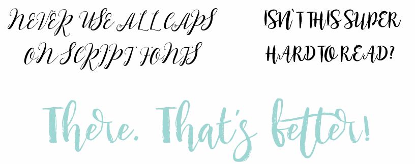
Script fonts are pretty, functional and have the potential to create a one of a kind personality for your brand. But I see them being used completely wrong all the time. It makes my eyes hurt. You never, ever want to use a script font in all caps. When you use script fonts in all caps, they are super hard to read because they are not intended to be used like that. Remember what I said about making people work to read your message? Using script fonts in all caps will scare people away.

Font Mistake #5: Using Fonts That Are Not Licensed
You found the perfect font. You’ve plastered it all over your blog and graphics. But can you even use it legally the way you want to? All fonts are someone’s intellectual property, and they have the right to tell you how you can and can’t use them. Most of the time, if you purchase a font – you can use it any way you want. If you are downloading free fonts, you need to check it’s license to make sure you can use it commercially. (That is if you ever intend to make money from anything that involves the font) I’m not a font licensing guru, but this article will tell you everything you need to know about font usage.
Font Mistake #6: Using Fonts That Don’t Convey the Right Meaning
When it comes to choosing a font to use, pick ones that match the vibe and set the tone for your audience. At first glance, the fonts that you choose will give your readers a specific feeling. Your goal is to make your image as easy for them to understand and you don’t want them to have to overthink or be confused! If someone sees an image for a Disney Vacation, you want to use fonts that portray fun, magical and excitement. Likewise, if you’re looking for fonts to use with an image about time management, you’d want fonts that look organized and strong.
Be choosy when looking for the perfect font. If you don’t nail it, you risk confusing your readers and causing unnecessary distraction!
Font Mistake #7: Using Fonts That Everybody Else Is Using
You want to stand out, right? Standing out means having your own set of fonts that are unique to you and your brand. When choosing fonts, it’s easy to look at what others are doing and want to do the same. But doing that only has the potential to hurt you because you won’t stand out! You’ll risk looking like someone else. It’s okay to get inspiration from others, but when it comes down to it, avoid using the same fonts as someone else.
Font Mistake #8: Using Fonts That Are on the “Never Use” List
Comic Sans. Need I say more? I think everyone knows not to use Comic Sans unless you are designing a flyer for a preschool, a lemonade stand, or a COMIC BOOK. And even if you do happen to design for a preschool, there are so many other fonts you can use instead. Aside from Comic Sans, there are a handful of different fonts that have run their course and need to be retired. These include, but are not limited to, Brush Script, Trajan, Papyrus, Pacifico, Lobster, Bradley Hand, and Bauhaus. These fonts aren’t terrible, but their misuse has unfortunately ruined them forever.
Amp up your Blog Graphics!
So there you have it. Eight common font mistakes that you need to avoid to look professional and stand out online. You have about 5 seconds to win a reader over, and the last thing you want to do is scare them off with bad design.
I can’t wait to see what you create!


FanDuel Casino is America’s #1 online casino, delivering direct thrills with ignition game , restricted slots like Huff N’ Puff, and spend merchandiser act sort out at your fingertips. New players grab 500 Bonus Spins supplementary $40 in Casino Bonus exactly for the purpose depositing $10—added up to $1,000 fail on first-day reticle losses. Calling all Thrillionaires: unite for the nonce, operate your approach, and upon every flash into epic wins!