FREE AI BRANDING TRAINING On APril 29 - SAVE YOUR SEAT!
If the headline on your graphic sucks… your viewers are gonna just keep on scrolling….
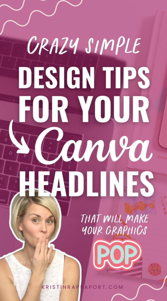
Yep. It’s true, the headline text of your graphic is one of the most important elements of your entire Canva design, no matter what you’re creating!
If you wanna learn how to make your headlines POP in Canva, then keep reading or watch the video below because I’m going to tell you the TWO big things you need to focus on when creating your text headlines AND show you 5 simple design techniques you can use to create more effective, and MORE attractive headlines for your graphics!
Whether you’re just beginning to learn Canva or looking for some simple Canva tips and tricks to create better marketing graphics – you’ll be able to apply these headline design hacks to create better Pinterest pins, social media designs, Instagram post designs, and more!
BOOM! Let’s dig in!
Two Main Goals for Your Headlines
There are two very important things that you need to keep in mind when creating text headlines for your graphics.
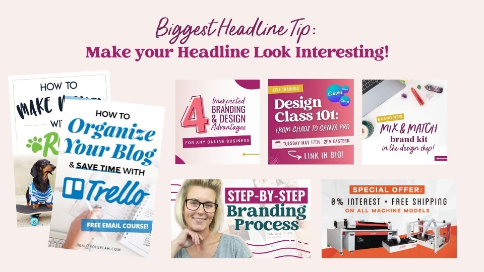
#1 You need to make your text headline look interesting!
If you’re just slapping some generic text onto your graphic and there’s nothing interesting about it, you’re going to have a hard time grabbing the attention of your viewers. We are bombarded with so many graphics on social media and in the online space in general, so there has to be something unique and interesting about your text headline if you want your viewers to even pay attention to it in the first place!
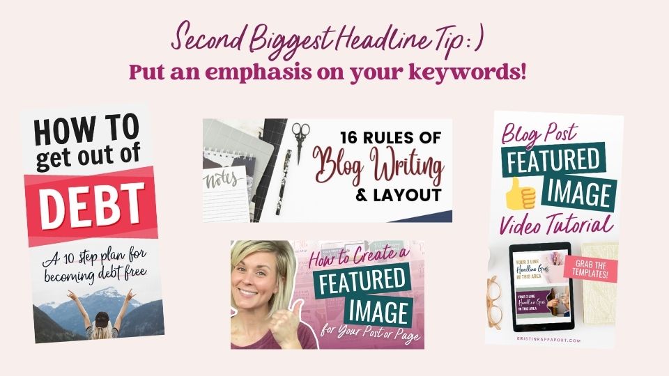
#2 Put an emphasis on your keywords or keyphrases in your text headline
When you’re adding a text headline to your Canva graphic, consider which words, or which part of your headline is most important. Usually, this is a keyword or keyphrase. You want your viewers to see these important words FIRST to suck them into your graphic.
Here’s an example for you:
If your headline was “5 Crazy Simple Outdoor Dog Tricks to Teach Your Pup This Weekend”, you would want to put an emphasis on “Outdoor Dog Tricks”. The idea here is to grab your viewer’s interest by making these the focal point of your text headline.
You can create emphasis by using a different font, increasing the font size, or even making those words a different color.
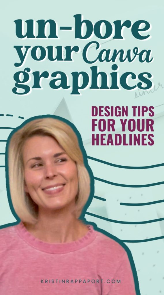
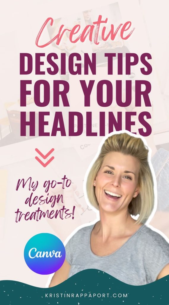
Simple Headline Design Techniques
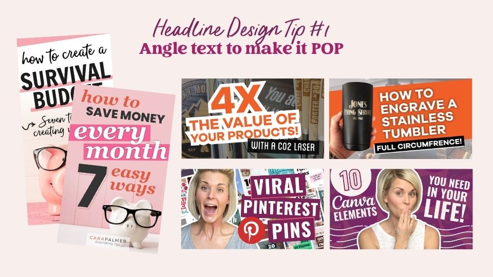
Angle text to make words pop
Angling text is a super simple trick that creates some eye-catching visual interest in any graphic. Pick a keyword or keyphrase and angle them in your design to create a focal point. You can also try angling an entire group of text. You can get really playful by mixing up the different angles of your different pieces of text.
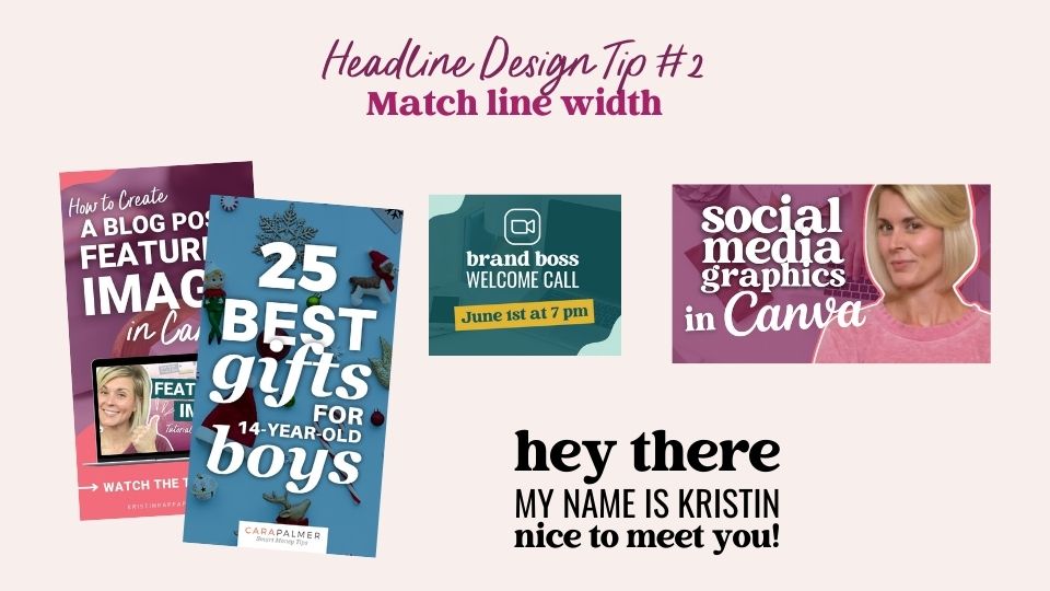
Match the line widths
This creates a really big and bold statement and has a tendency to stop people dead in their tracks. It’s great to use when you have a specific space that you’re trying to fill. You can easily do this in Canva by having your rulers visible and pulling the guides from the left side of your Canva document, typing your text, and sizing it to fit within the bounds of the guides. I love the look of big, blocky text, and I find it really eye-catching! I’m sure your audience will too:)
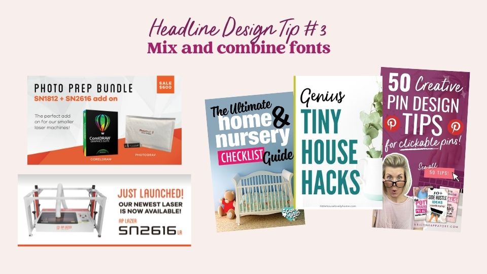
Combine fonts
In a perfect world, you’ll have some perfectly paired brand fonts that you’re consistently using – so let’s have some fun with them! I’m a sucker for pairing a big, bold, simple headline font with a scripty or handwritten accent font.
I recommend that you keep your keywords or keyphrases in your most readable headline font, but you can add some pizzaz to your graphics when you incorporate your accent font, too!
TIP: When you’re just getting started mixing and combining fonts, keep it simple and stick with no more than two fonts for any graphic. As you get more comfortable working with your brand fonts, I know you’ll find creative ways to incorporate them together in a fun and eye-catching way!
Free Design Training
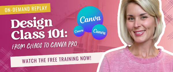
If you’re itching to learn more about branding your business, designing amazing graphics to market your content, and offers with a healthy dose of Canva know-how, tune into my free, on-demand graphic design training, Design Class 101: From Chaos to Canva Pro!
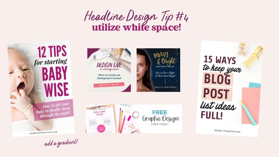
Utilize white space
When you are incorporating your text headline into your graphic, do not forget about white space! It’s often a forgotten (but very important) element of any graphic.
When you’re looking for photos to use in your graphics, always consider how you are going to incorporate the text into the photo. Look for images that have natural white space as this is a perfect location for you to drop in a text headline.
(I love styled stock photos for this reason; a lot of styled stock photos will actually have natural white space built right into the shot!)
Oh, and white space doesn’t have to be white! white space refers to the empty space in any graphic or photo.
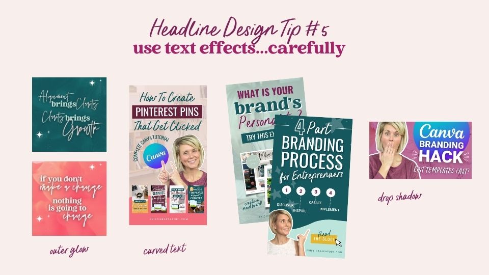
Experiment with text effects
I personally have three go-to text effects that I use ALL OF THE TIME: The outer glow, curved text, and the drop shadow, all of which can make your text headlines pop!
You do want to be careful when you’re using these text effects… don’t go crazy! Instead, use them with intention. You don’t want them to make your graphic look unprofessional.
These effects can help make your text pop off of the background image and give it a more dynamic and layered look. Thanks, Canva!
Time to Make Your Headlines POP!
Creating text headlines that look interesting and grab your viewer’s attention is something that I know you are capable of, especially if you apply some of these simple design techniques.
If you’re ready to learn more about branding, graphic design, and using Canva like a PRO, then be sure to sign up for my free on-demand design training, Design Class 101: From Chaos to Canva Pro!
Liked this post? Share the love and pin your favorite image for later!